Final year project
Rebrand of The Ordinary [Read more]
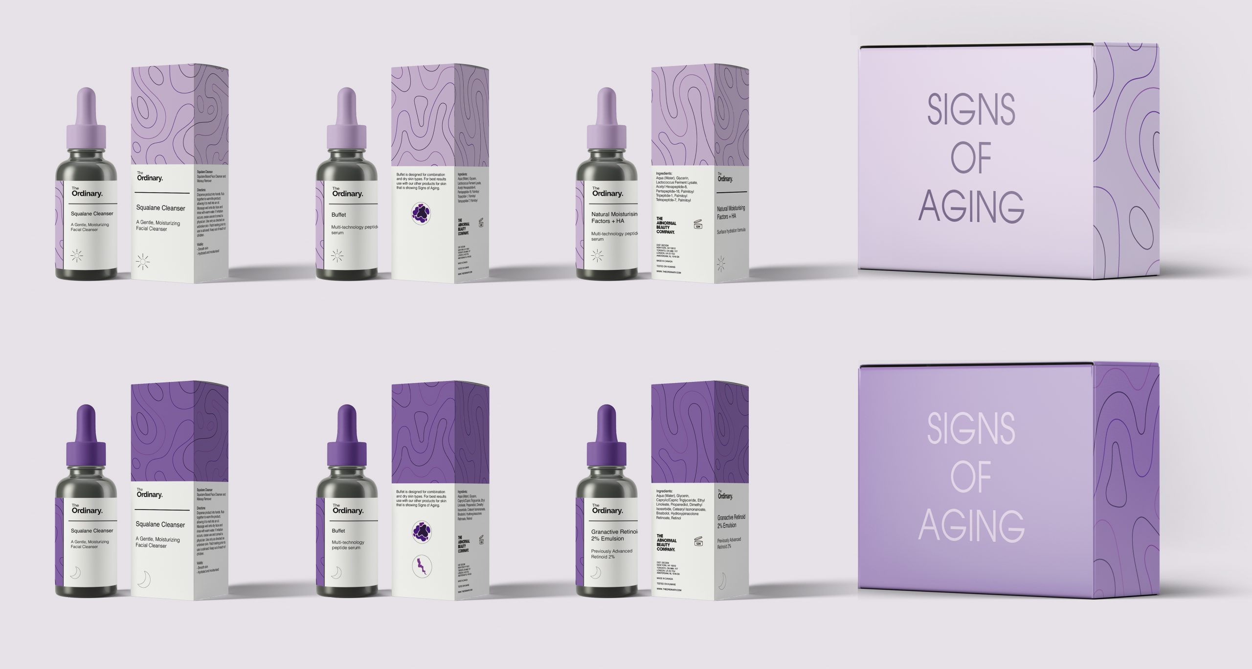
Rebrand of ‘The Ordinary'
This collection shows the regimen for Signs of Aging. This collection has been made so the user has both a morning and evening routine, the packaging itself has a breakdown on how to use it and how it works for the skin.
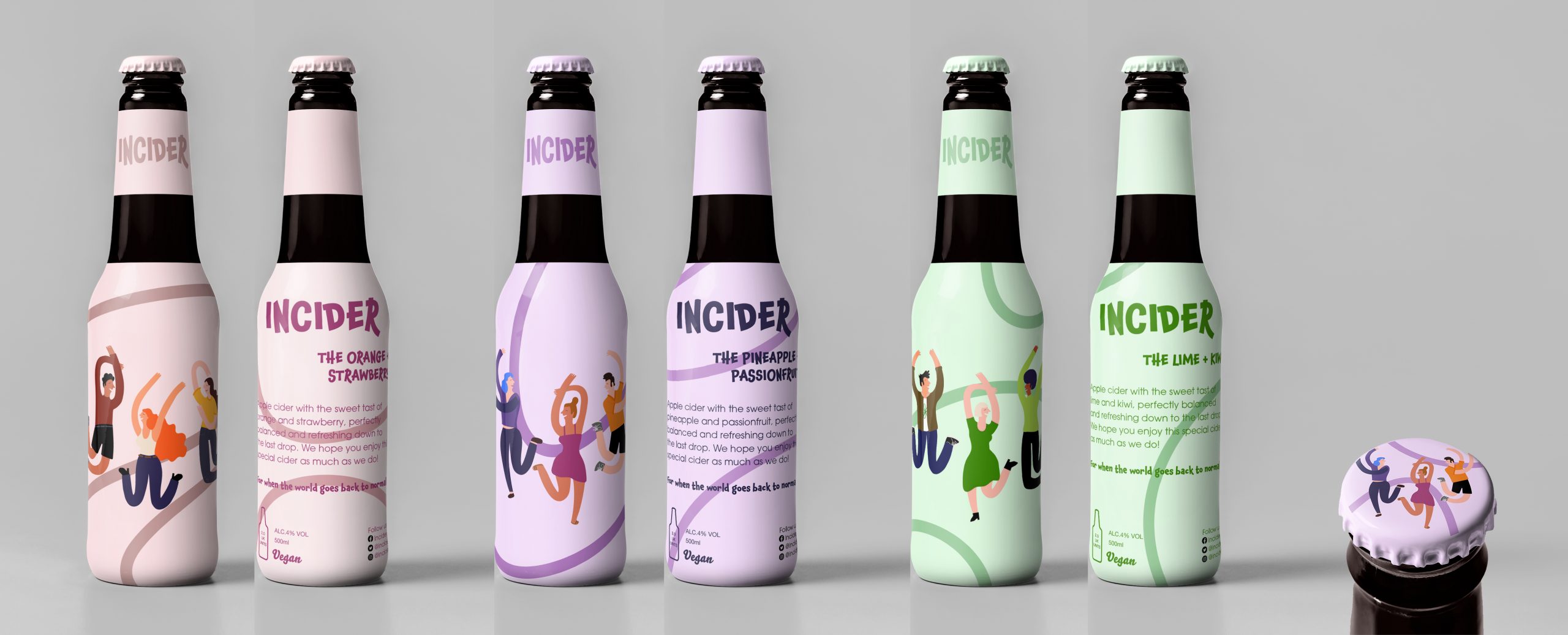
INCIDER
The aim of INCIDER is to bring everyone socially back together when COVID-19 restrictions end. This project celebrates the unity of people, whilst also providing a tongue in cheek approach to how we have all been isolated because of the pandemic.
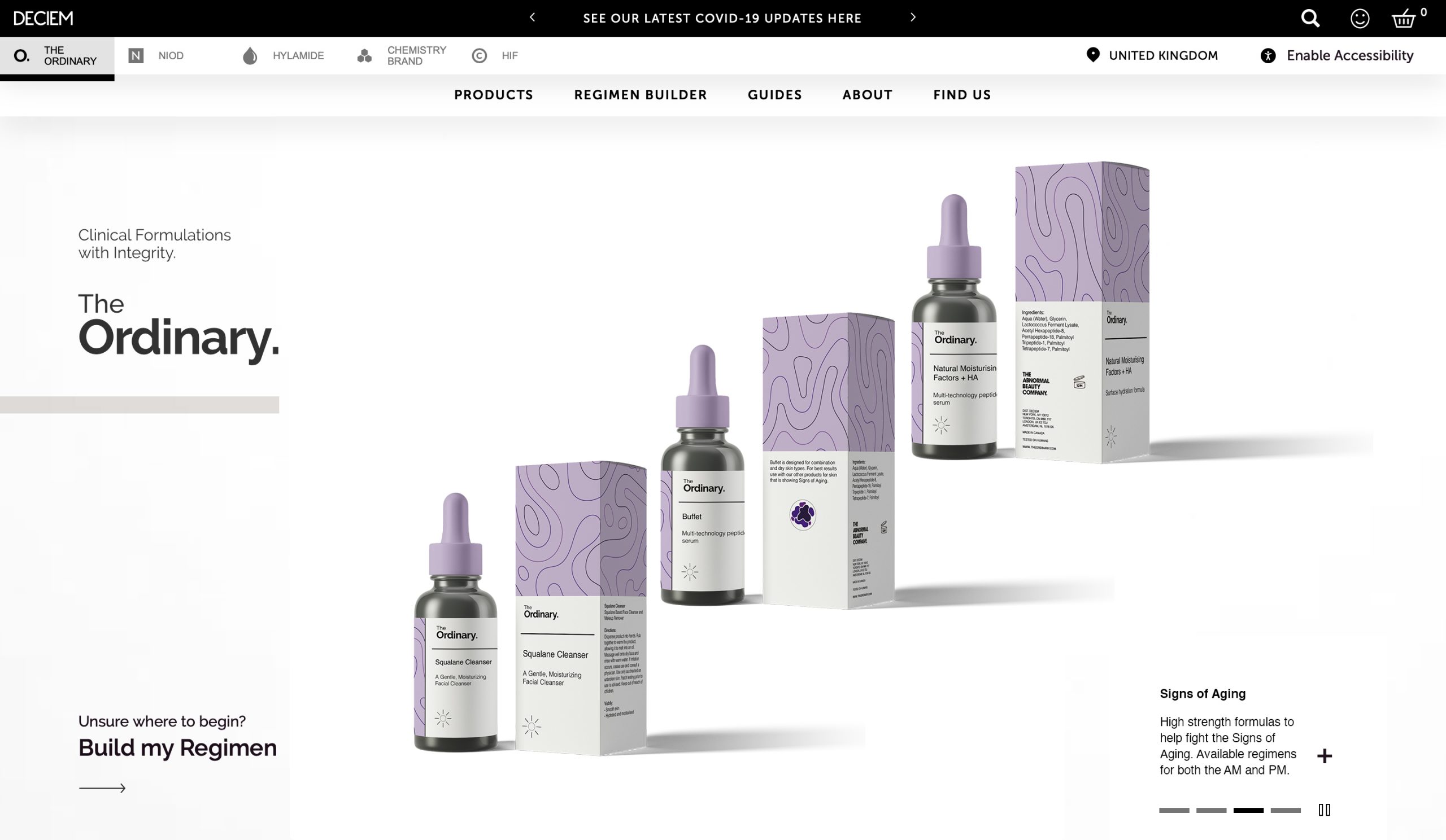
The Ordinary Website Design

Net Designs for The Ordinary
Blue - Signs of Congestion
Green - Antioxidant Support
Orange - Hydration Support
Pink - Simplistic Regimen
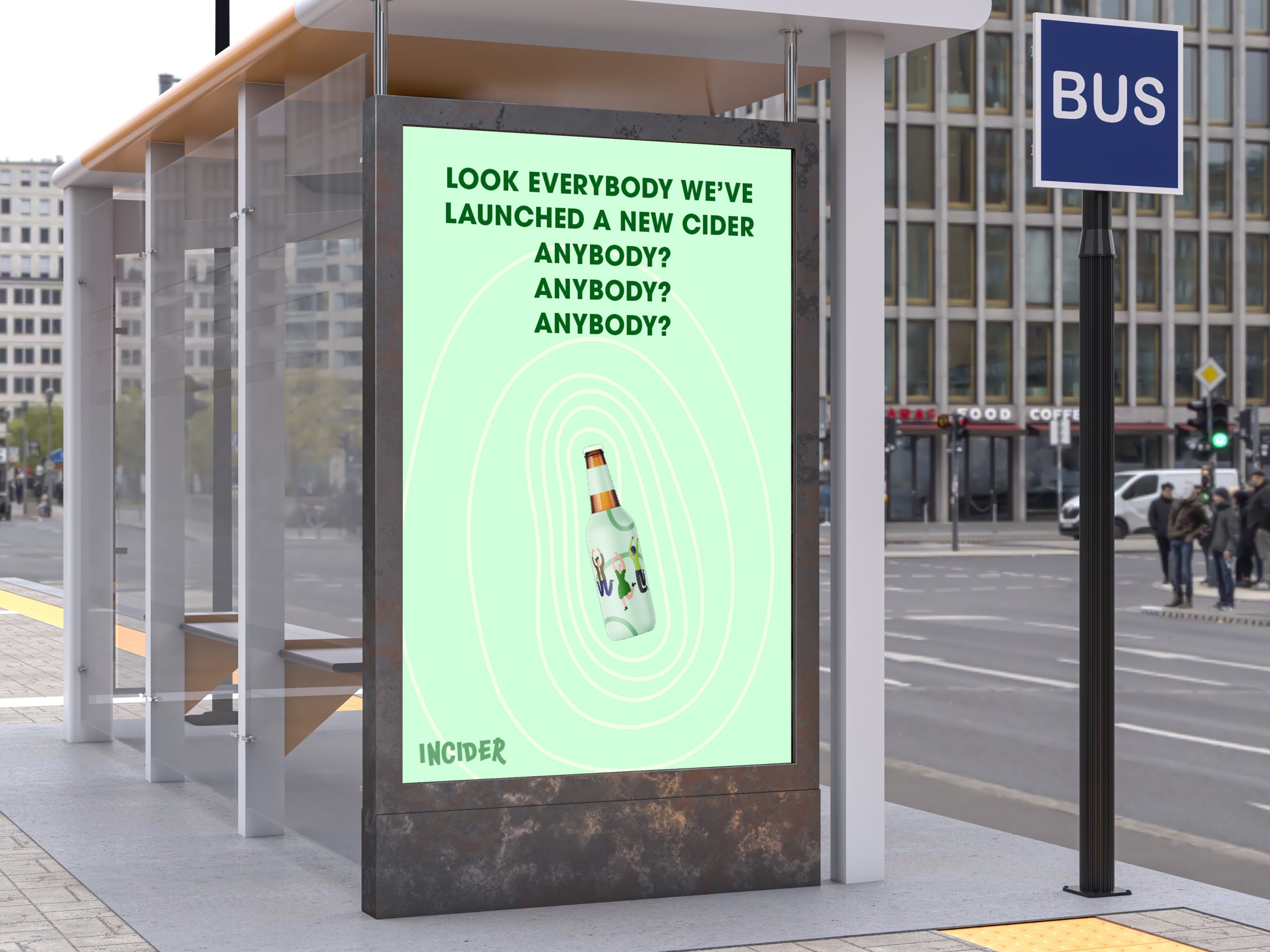
INCIDER - Bus Stop Poster
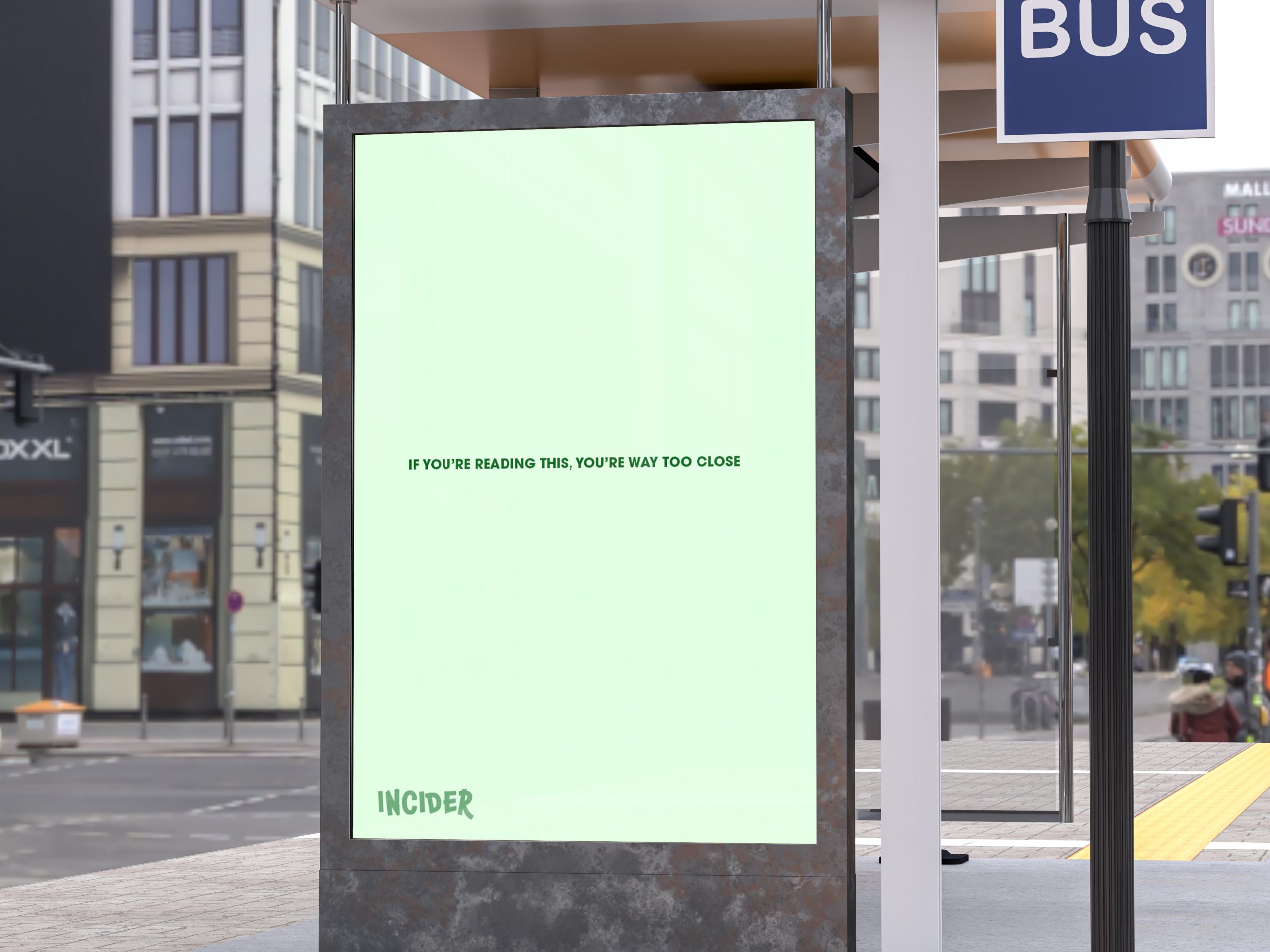
INCIDER - Bus Stop Poster
“If you’re reading this, you’re way too close.”
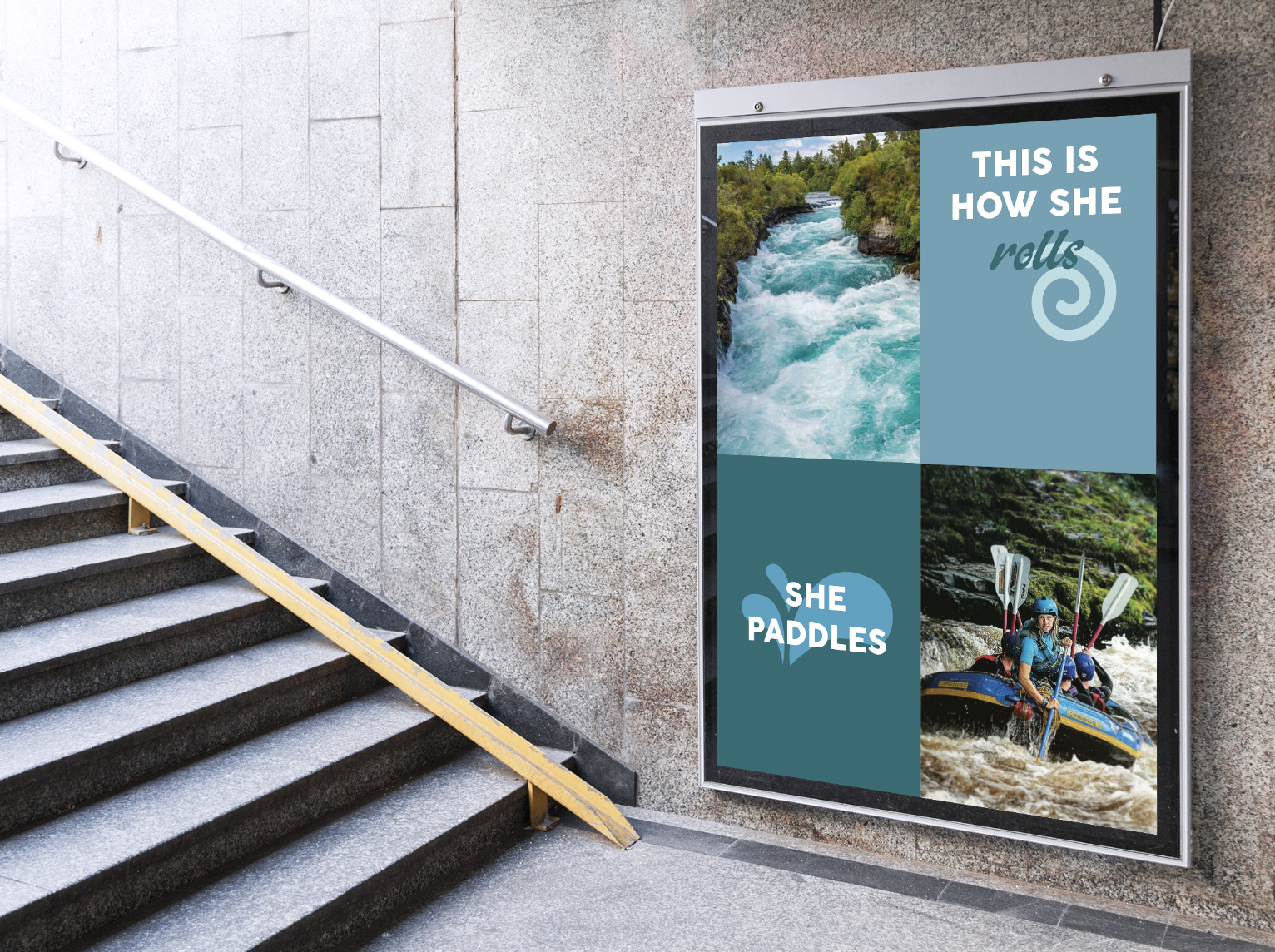
She Paddles
This project aims to encourage more women in the UK to take part in paddle sports.
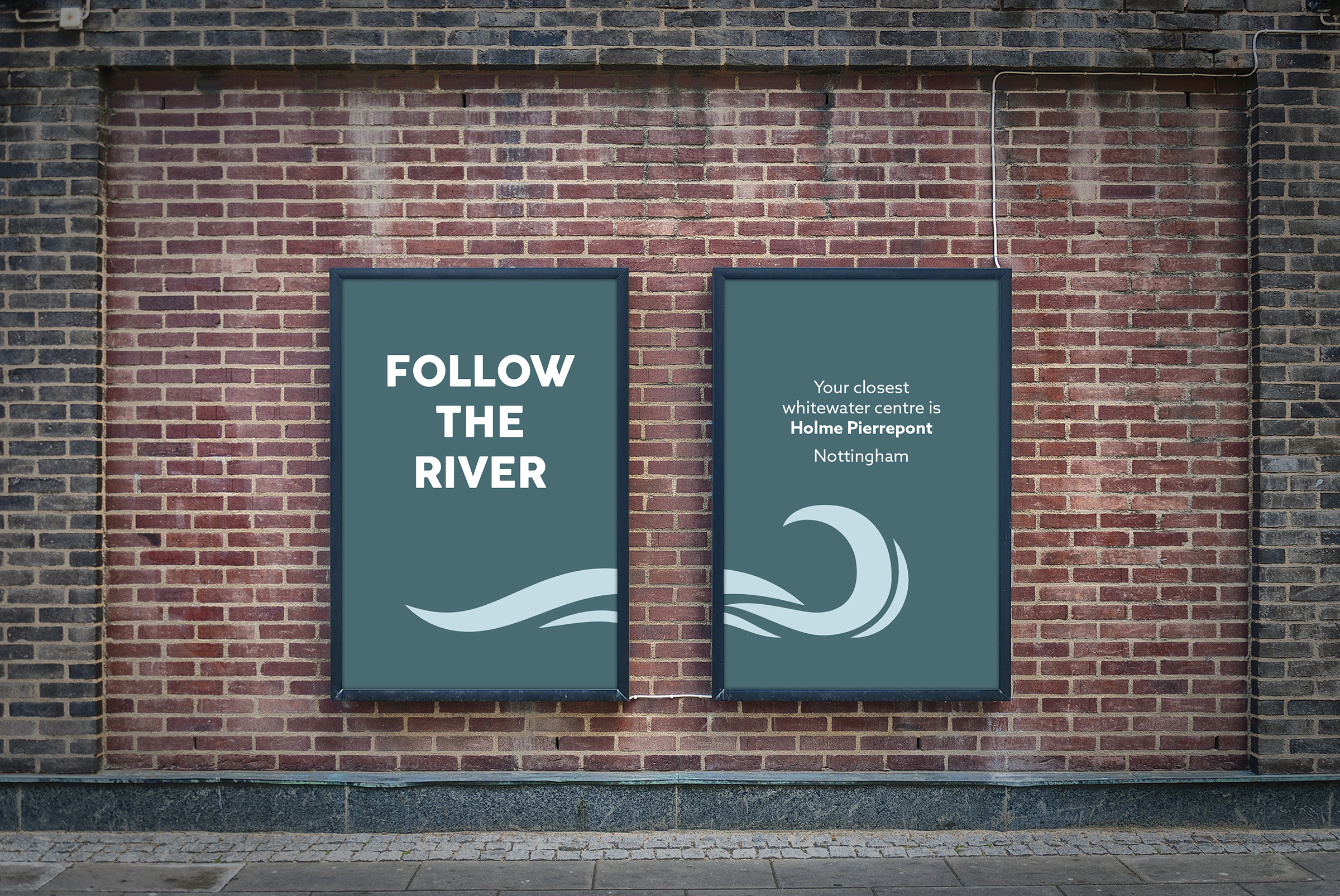
She Paddles Directional Posters
Zoe Hall
The approach of this redesign was to target mature women between the ages of 40 - 50 years. The designs are minimal and mature to represent this demographic. The purpose behind this redesign was due to the lack of creativity on ‘The Ordinary’s’ existing packaging, website, and branding material. Also, their website can be difficult to navigate, if you don’t know what your are looking for, hence, the creation of regimen guides that will help the user to find the skin care routine they need. Each colour and pattern represent a different skin concern.
I have accepted a place at Sheffield Hallam University to do a PGCE in Secondary Art and Design. This will be a great opportunity to pass on my knowledge to the next generation and encourage them to follow a creative pathway.
Final year project
Rebrand of The Ordinary
Awards
Exhibited - West Nottinghamshire College 2016
Action Volunteer 2016-18
Student Representative for Graphic Communication and Illustration 2017-18
Rocksoc Media Representative 2020-21
Work Experience
Graphic and Digital Design Intern at Loughborough University - August 2018 to July 2019