Final year project
#ReliveTheRave / Wasted / Re-Deuce / Locool [Read more]
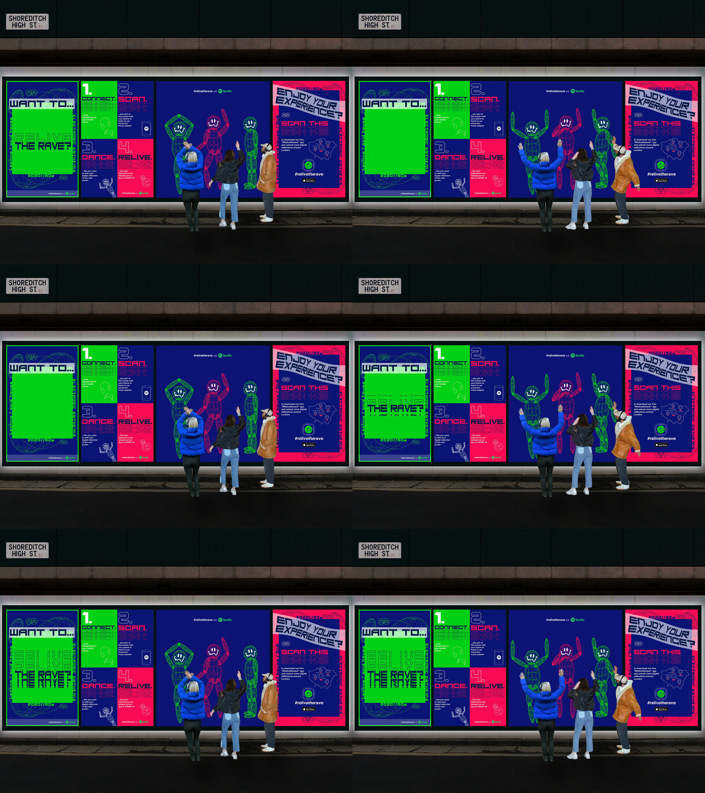
#Relivetherave: User Experience Campaign
This is an interactive artwork display that I designed as part of a nostalgic "#Relivetherave" campaign. It’s aimed at electronic music enthusiasts, specifically, that are restricted from going to music venues due to COVID-19. This poster acts as a safe platform to allow them to interact with and "relive" the rave scene in a silent disco style outdoor experience. This is achieved through listening to electronic music through their headphones together and dancing along with the motion-sensored figures.
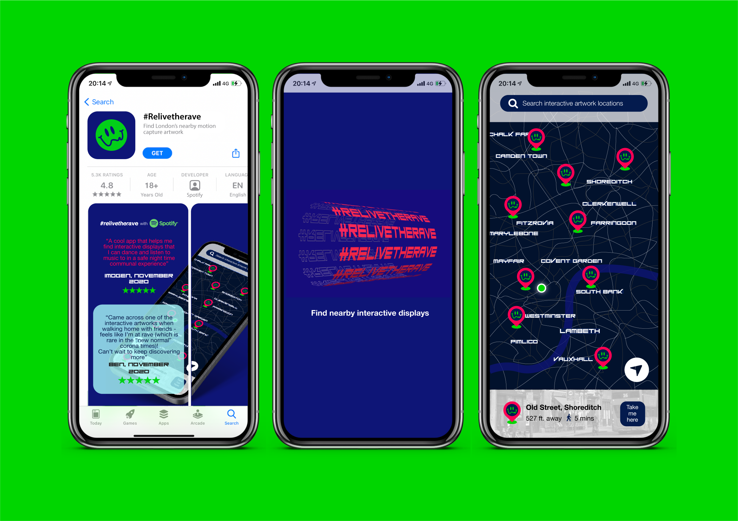

#Relivetherave: Wayfinding App
The free iPhone app uses wayfinding to help the user find locations of interactive displays as shown on a map. The user opens the app and allows it to use its current location. A map opens up showing the user’s position and the pinpointed locations of the various #relivetherave interactive displays.
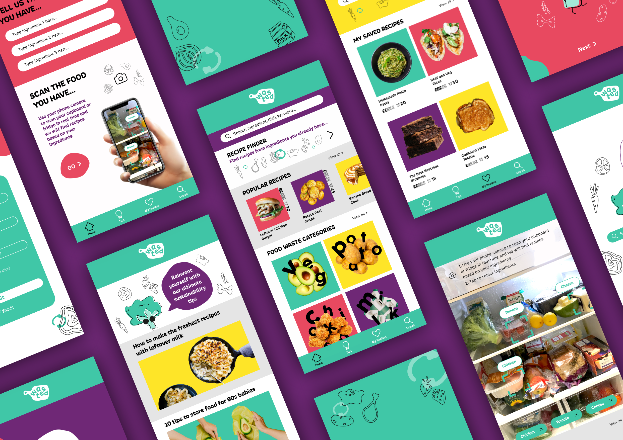

Wasted: UX/UI
Around 18000 tonnes of food is being wasted every day, with university students playing a large part in this. The “Wasted” recipe app encourages cooking with food that would usually be wasted. The aim of “Wasted” is to tackle these societal issues subtly and to stray from the standard corporate recipe app. This helps contribute towards the brand's mission of reducing food waste and contributing towards a circular economy.
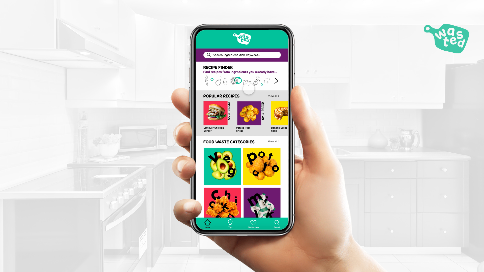

Wasted
The app allows the user to browse popular recipes or recipes made with food waste items that are most commonly wasted by students. The ‘Recipe Finder’ function allows the user to type in ingredients that they have or scan them with their camera to bring up recipes based on the food they have in their fridge/cupboard. The app also includes articles with tips around food sustainability, a saved recipes section and more.

Re-Deuce Campaign: D&AD Brief
Driving emissions use up to 200g of CO2 per km travelled, compared to other more sustainable transport methods like taking the bus.
Our out of home guerrilla marketing campaign tackles this by showing tennis fans the visible effects of emissions on climate change at the Australian Open and offers sustainable alternatives. This urges fans to change travel habits to matches and day to day life. Adam Rutherford and I worked successfully by using our independent and collaborative skill sets to drive the project forward, which was a key success factor in our campaign.
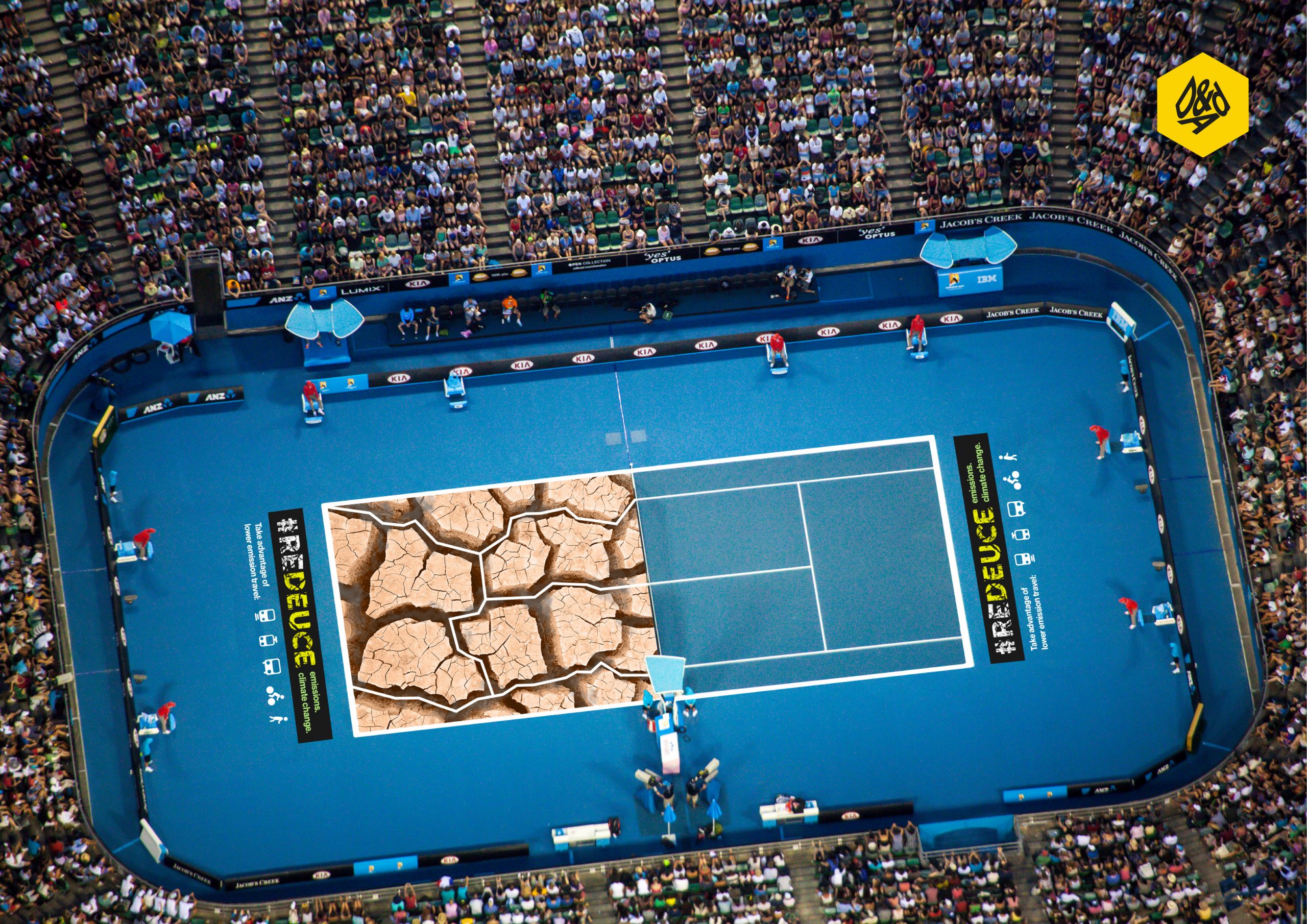

Re-Deuce: Rod Laver Arena Court
The Australian Open pitches have been turned into cracked, scorched grounds to highlight the detrimental impact that transport emissions have on our climate. Unexpected graphics are also placed throughout the journey of the Australian Open. From the 246 bus route to the car park and the tennis courts.
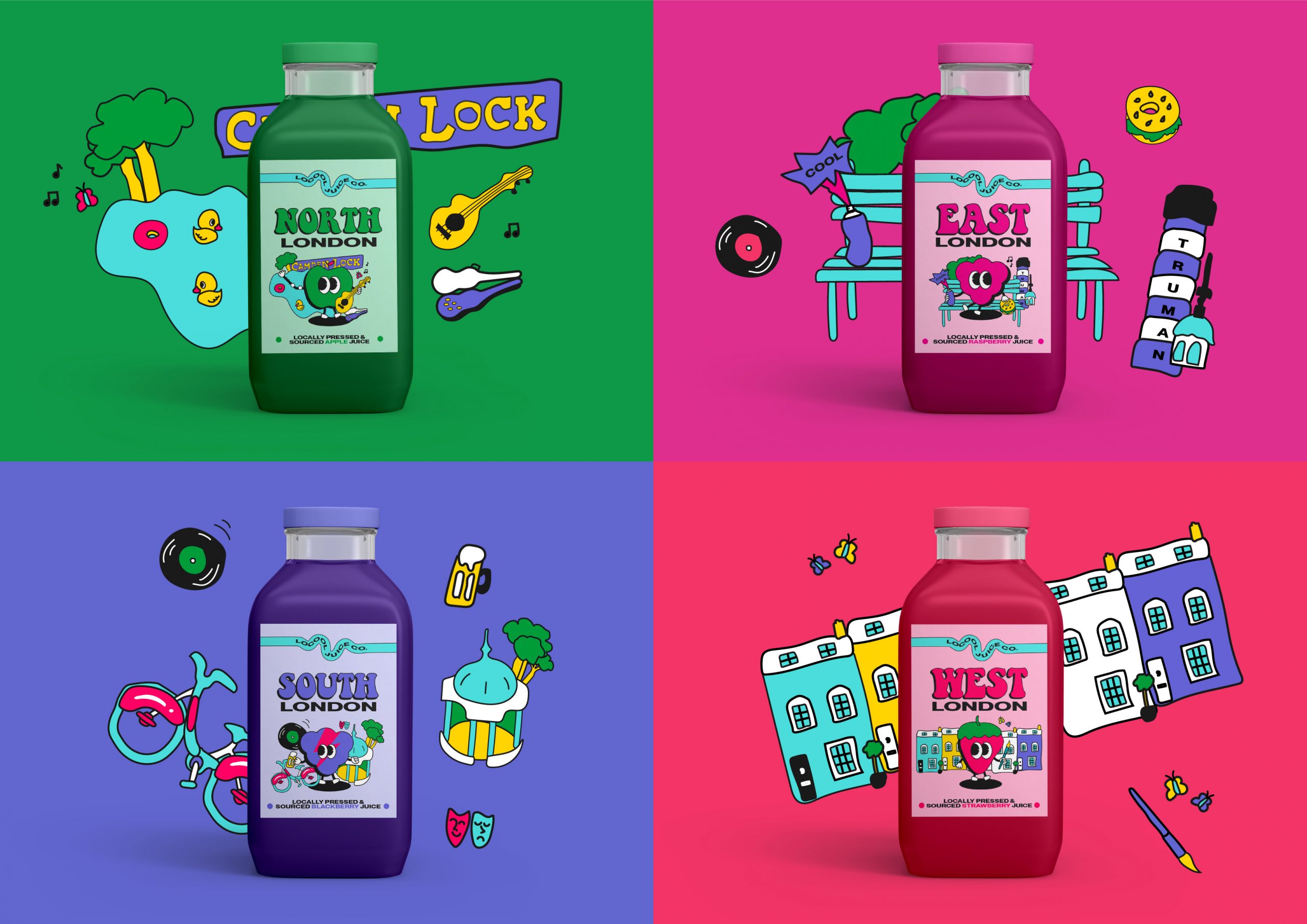

Locool: Sustainable Drinks Brand
Locool is designed for the Chrysalis Student Awards, set by BrandOpus: "Create a new drinks brand with a distinctive & compelling sustainability story at its heart."
Locool's mission is to better the planet by decreasing food miles and carbon footprint. This is why our juice is locally pressed and sourced from markets in and around London. We only use seasonal fruit to squeeze into our North, East, South and West London drinks and use glass to cut down on waste as it can be indefinitely recycled. This is further emphasised by introducing upcycling in our packaging. The empty glass bottles grow seasonal plants (i.e. strawberries) through the seed embedded fruit by-product ring holder.
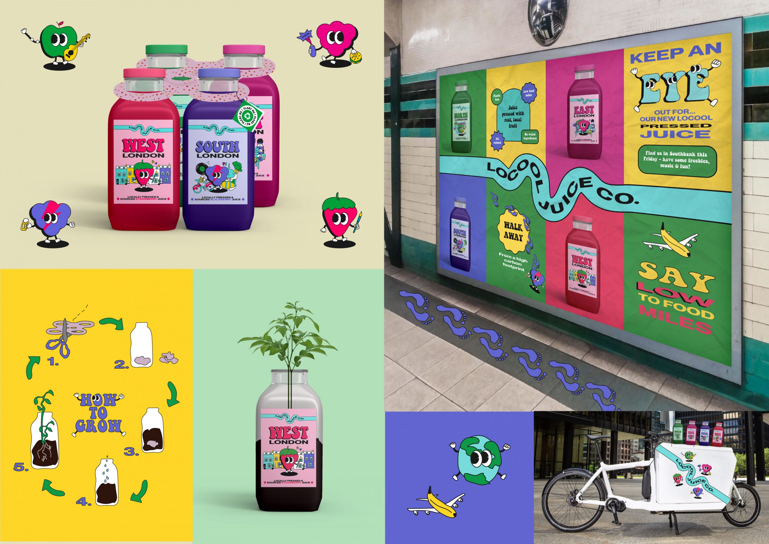

Locool: Further Brand Application
We asked local Londoners what is most iconic to their culture and contextualised this research into the illustrations and character design of the labels. As well as this further extensive research into London culture was conducted. This is to authentically resonate with more of the brand and retain historical, nostalgic context. This is further emphasised with the retro imagery which is becoming increasingly popular with youngish adult audiences.
Emily Fagg
I am a multidisciplinary designer focusing on branding and visual identity. I am curious about the society around me which I channel through different design mediums to understand and design outcomes based on the world my audiences live in.
A lot of my work is centred around sustainability, produced predominantly through branding, UX/UI, kinetic typography, vector illustration and advertising. My design approach uses my flexible skillset based on my vision of communication to create an impact for the better.
My placement year in London has provided an exciting start to my career, I worked in the market research industry in the in-house design and data visualisation team. This has strengthened my ambitions to work for a design agency in a dynamic city, eventually moving to New York.
Final year project
#ReliveTheRave / Wasted / Re-Deuce / Locool
Work Experience
I have had work experience in a number of companies ranging from design agencies to in-house design work with my most recent being Populus Ltd. (now merged as Yonder Consulting).
I worked at Populus as a Design intern on my 12 month placement year in the research sector. Some of my main responsibilities included: proposal deck design, infographics, print design, illustration, iconography and social media content.
I mainly worked in-house yet have carried out work for clients including BT, Network Rail, JTI, CALM and The Drum.