Final year project
Moja, 'Goodness in Every Sip.' [Read more]
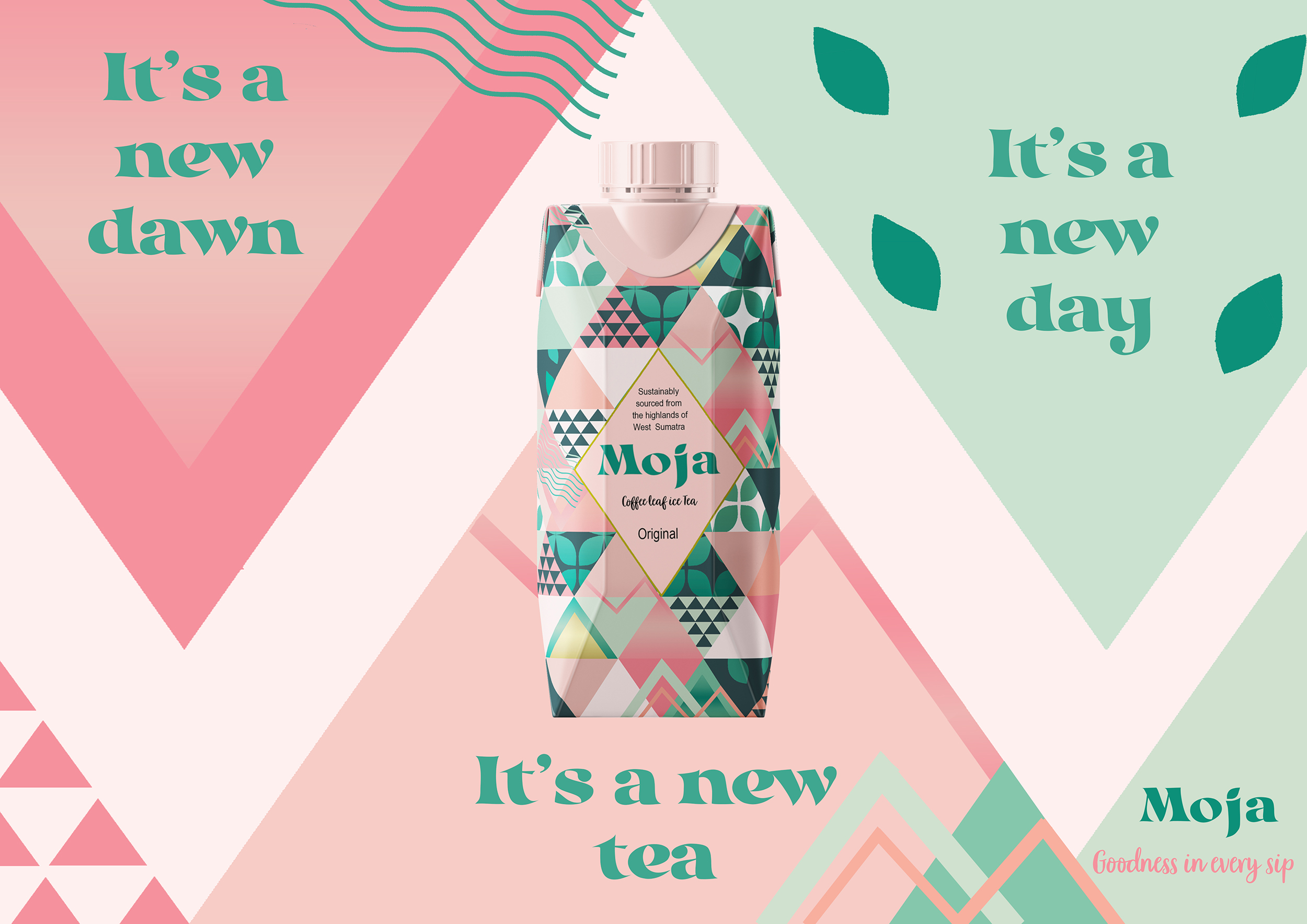
Moja, Coffee Leaf Iced Tea
The project is a response to the BrandOpus brief to design a sustainable drink with sustainable packaging. As an iced tea lover and coffee drinker, I discovered that the coffee industry is saturated and seasonal. I wanted to create a more sustainable drinks solution that benefits coffee farmers and meets the increasing demands of the industry. Moja uses humour to make a statement of changing what it means to be a tea and a coffee. The witty puns show the positive natural energy of the coffee leaf and challenge premium sustainable drinks brands that are often unengaging to a younger audience.
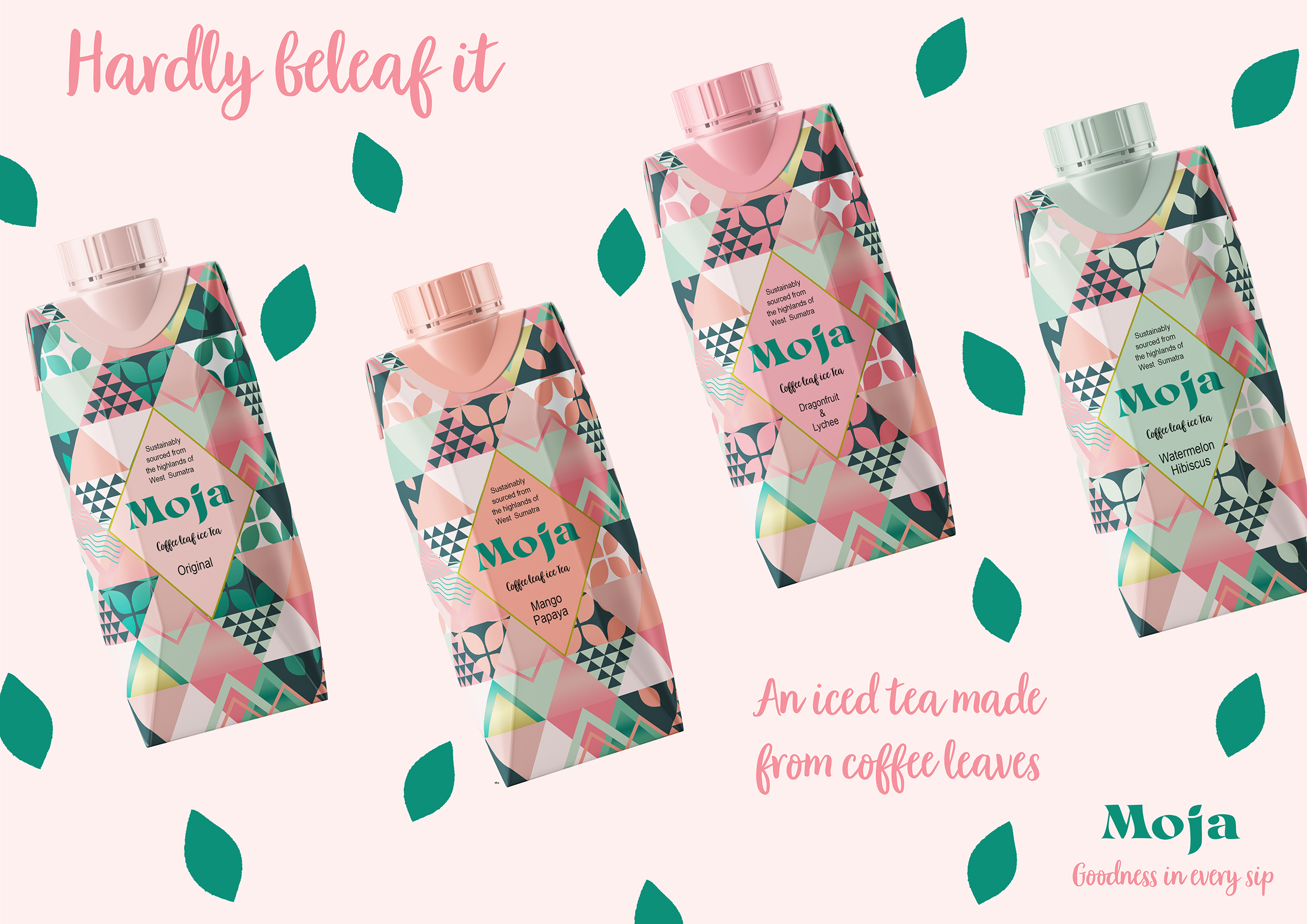

Moja, Coffee Leaf Iced Tea
I found that coffee leaves have been consumed in Sumatra for centuries in the form of tea. Using discarded coffee leaves will provide a stable supplement income for coffee farmers as well as providing health benefits to the consumers.
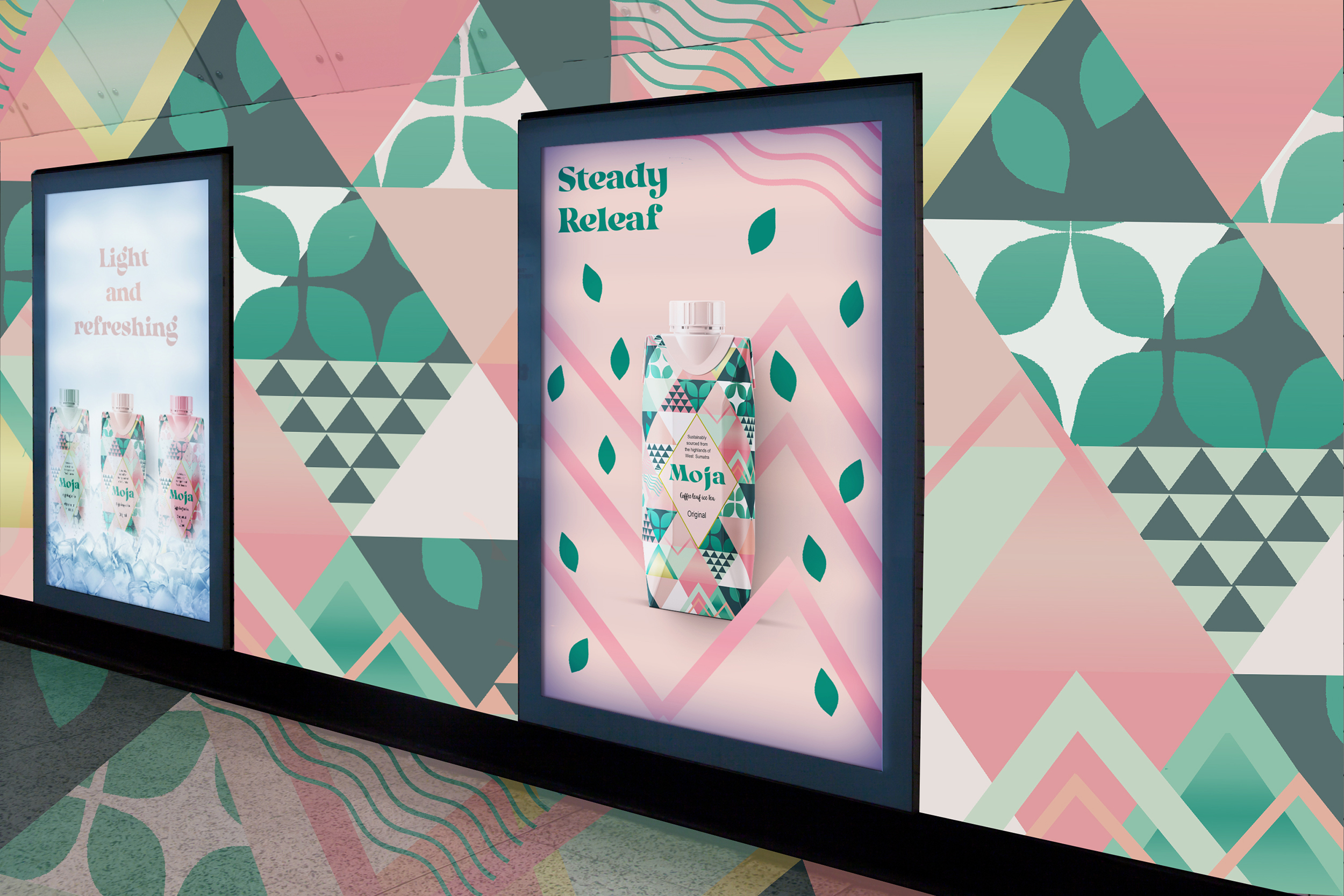

Moja, Brand Launch
I wanted to create an uplifting energetic drink brand creating good change for the consumer and to the women coffee farmers in Sumatra. 'Goodness in Every Sip', good for you, benefitting others.
The main target market is 18-24-year-olds, looking to make lifestyle changes in health and sustainability. Moja’s brand launch will be in London to gain maximum exposure while people are commuting to work or visiting London.
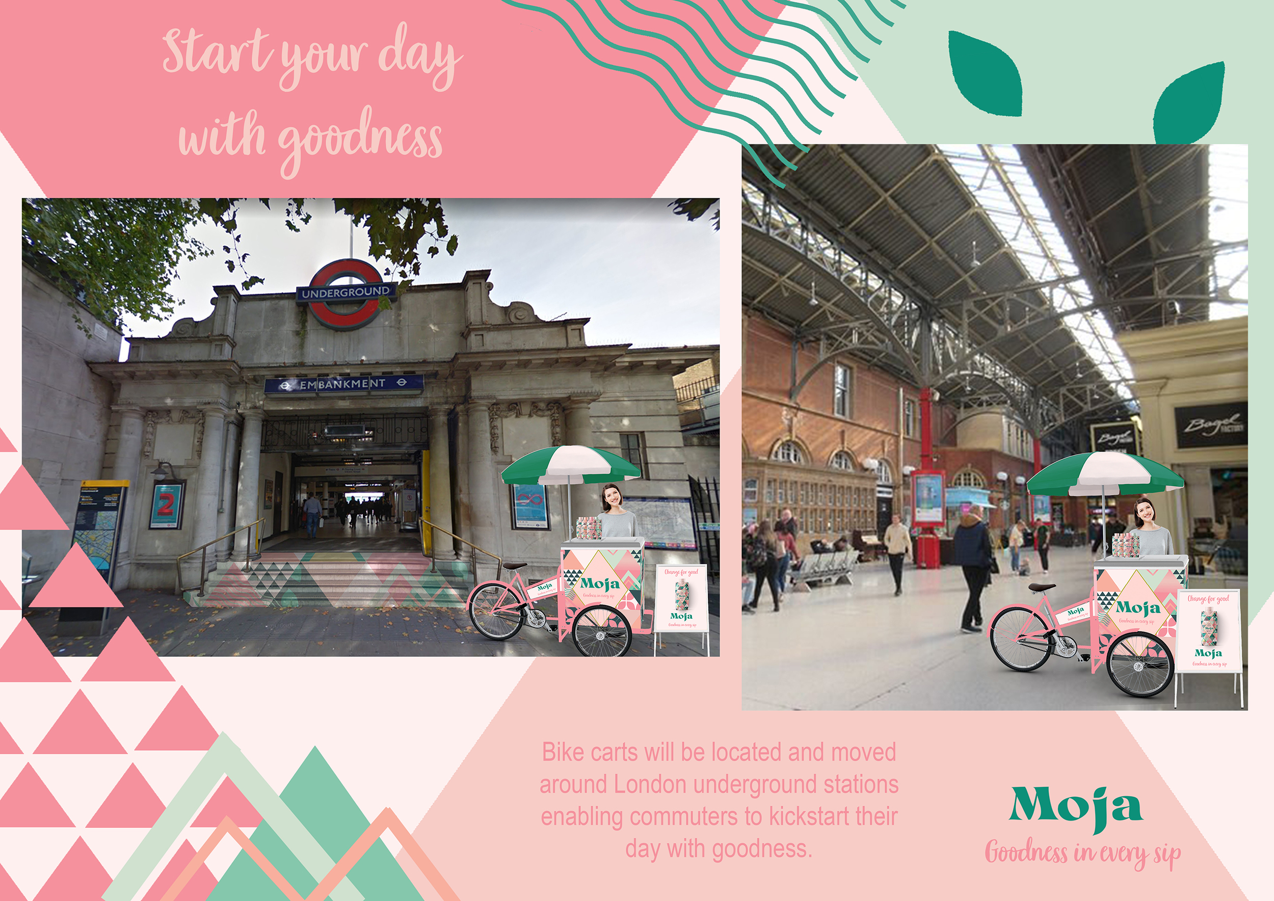

Moja, Brand Experience
The brand experience will encourage people to change for good with bike carts around London underground stations as well as the stairs to show the energy lift of Moja.

Moja, Brand Experience
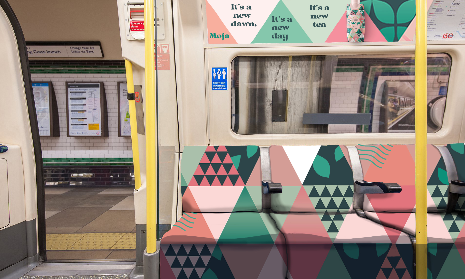
I designed Tube experience seating with the iconic pattern so that commuters can drink Moja whilst travelling.

Moja, Brand Exposure
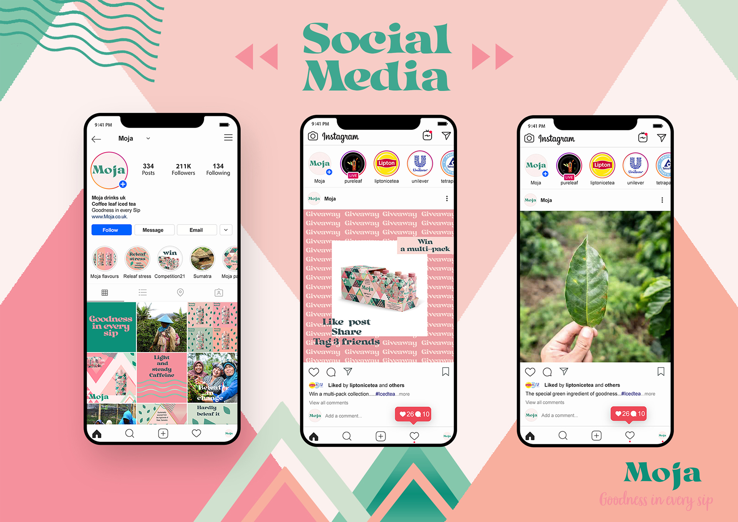
Brand exposure on Instagram will attract my target market and reflect the brand personality. The account features how coffee leaf iced tea can bring good change to Sumatran women farmers and further encourages a healthier and more sustainable lifestyle to the consumers.


Life Isn’t All Ha Ha Hee Hee - Book Cover Design
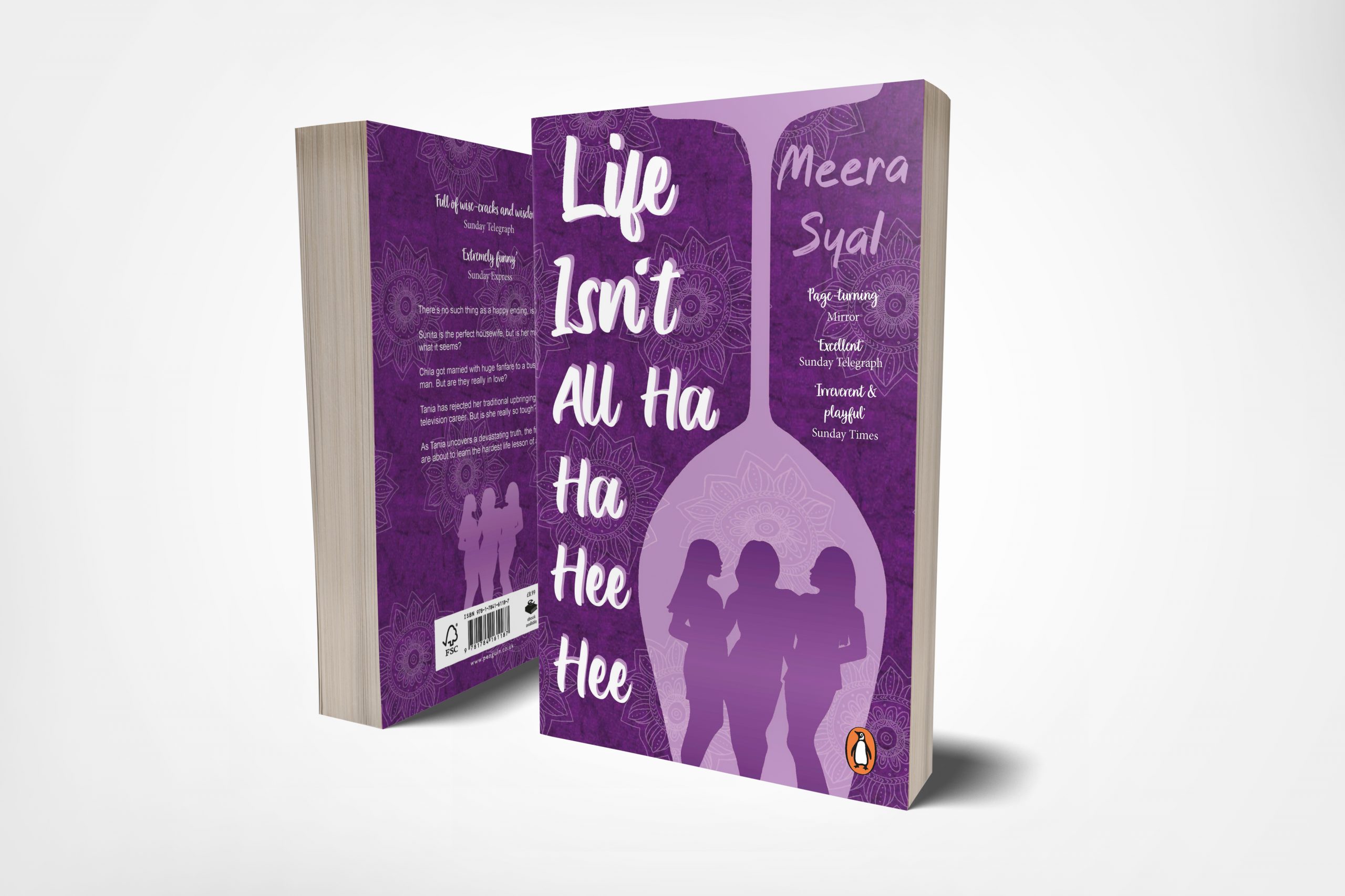
The wine glass is a symbol of friendship and the downfall of the 3 characters. The glass suggests how the women are trapped in their lives struggling with the balance of Indian culture/ tradition and British life, reflecting on their childhood freedom and dreams. I designed an Indian pattern to subtly reflect Indian tradition which represents relationships and marriage. I added a tear to the ‘Isn’t' in the title to bring a reference to the idea behind the title of the book, “Life Isn’t All Ha Ha Hee Hee", so if you know there’s going to be a few tears, you might as well enjoy them.

Book Mockup of 'Life Isn’t All Ha Ha Hee Hee'
Book mock-up showing the front and back covers.
Amy Attrill
I’m a multi-disciplinary designer who looks for innovative and creative design solutions with a contemporary visual style.
I have a keen interest in branding, packaging, typography, pattern design and logo design. Sustainability and social issue design are of strong interest to me along with the idea of making a change every day. My branding project consists of playful energy and charm using wit and humour that attracts a younger audience to more serious issues. My research is extensive, enabling me to gather deep insight into current trends and broad inspiration from different disciplines. I use my drawing skills to quickly sketch out concepts which is crucial for the ideation stage, allowing me to experiment with a myriad of ideas. I adapt and combine my skills for each brief making each project unique, working with photography, illustration, type and image.
Final year project
Moja, 'Goodness in Every Sip.'