Final year project
Storytelling Through Visuals [Read more]
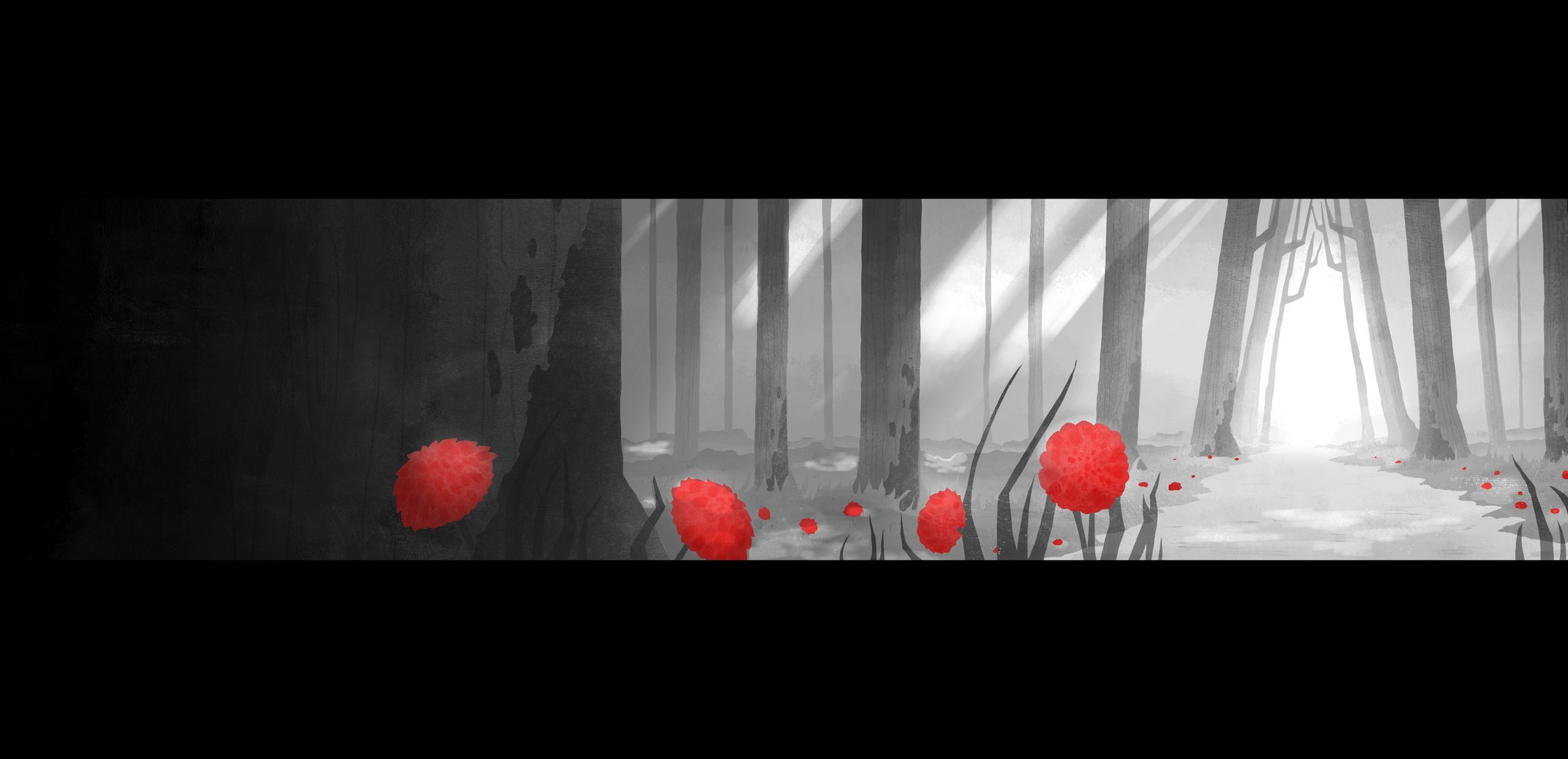
Woods Background for my Final Major Project
I wanted to create a background that looked both welcoming and sinister depending on the scene it is in. The use of only red was done to push the fact that the story is a retelling of Little Red Riding Hood while also emphasising the darker atmosphere.
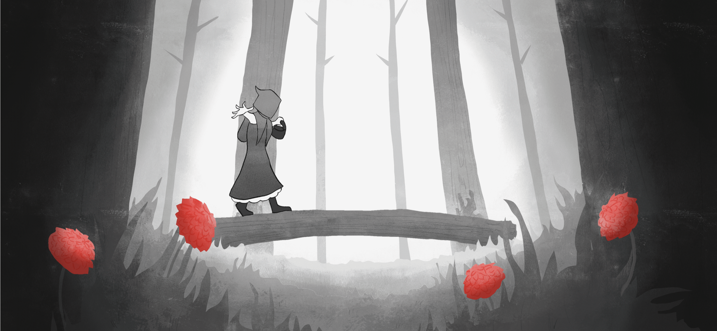

Frame from my Final Major Project Final Piece
This is a singular frame from a section of animation I did for my Final Major Project. I believed this frame was a good representation of my animation style.
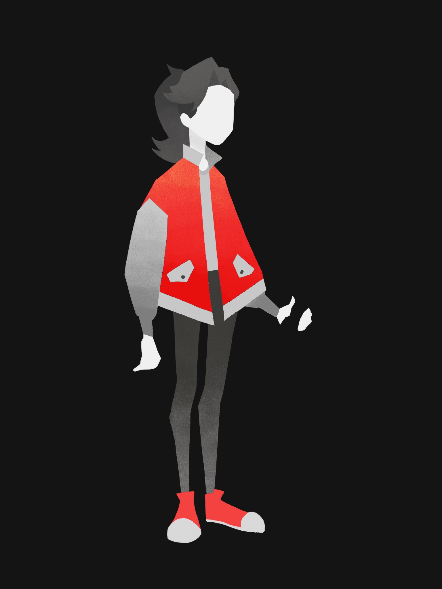

Character Design for my Title Sequence Project
I wanted to create a simplistic design that's unique while also being generic so that people can see themselves in her.
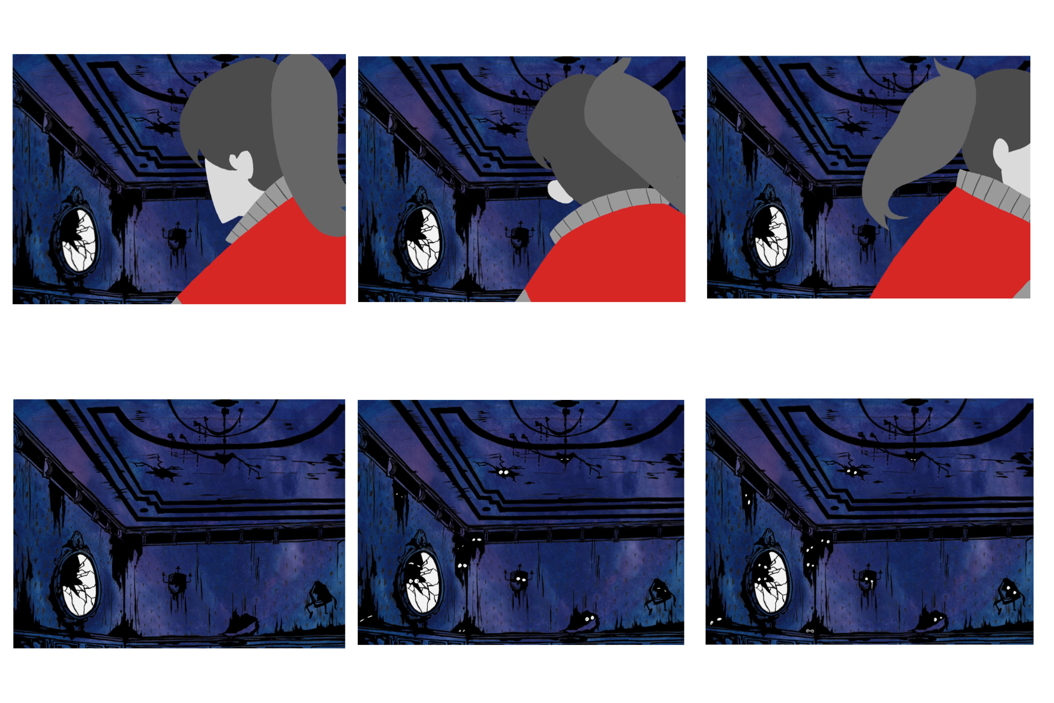

Screenshots from my Title Sequence Project
Here I tried to show a girl looking for ghosts but always missing them. This scene was quite simple but very effective and clear, being that she turns around, and the ghosts appear behind her back. What made this particular scene stand out from the rest were the eyes in the darkness. In my opinion, they worked the best at communicating that the girl isn't alone and that she was being watched in a somewhat creepy but not violent way.
Alice Williams
Through my work, I try to create a strong sense of history and atmosphere, where people don't need to necessarily know the meaning to enjoy it.
I chose to create an animation to enhance my skills in the area of Visual Communication. So far I have learnt a lot and believe I have significantly improved.
Final year project
Storytelling Through Visuals