Final year project
The Roaring '20s [Read more]
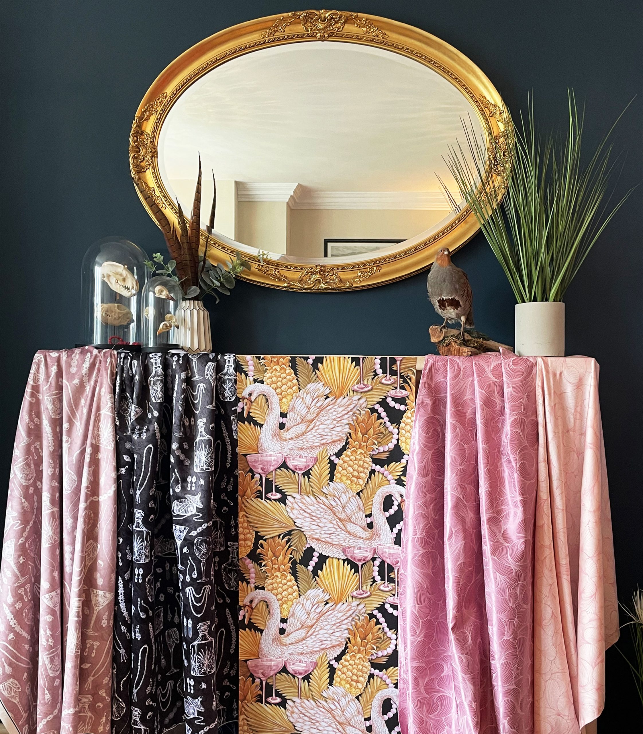
The More 'Feminine' Part of The Collection
This image is of the more feminine inspired side of the collection. The softer, flapper girl and jewellery inspired designs that show this lighter colour palette and overall more of a feminine feel. The wallpaper is a bold, statement half drop digitally designed from my paintings, which fits perfectly with the two pink colourways of my multidirectional scallop design (right), which I did in the print room. On the left is a black and a pink colourway of my crystal/ jewellery design, digitally printed on a soft velvet and a duchess satin, these are intended to be cushions with bold contrast piping for the physical exhibition.
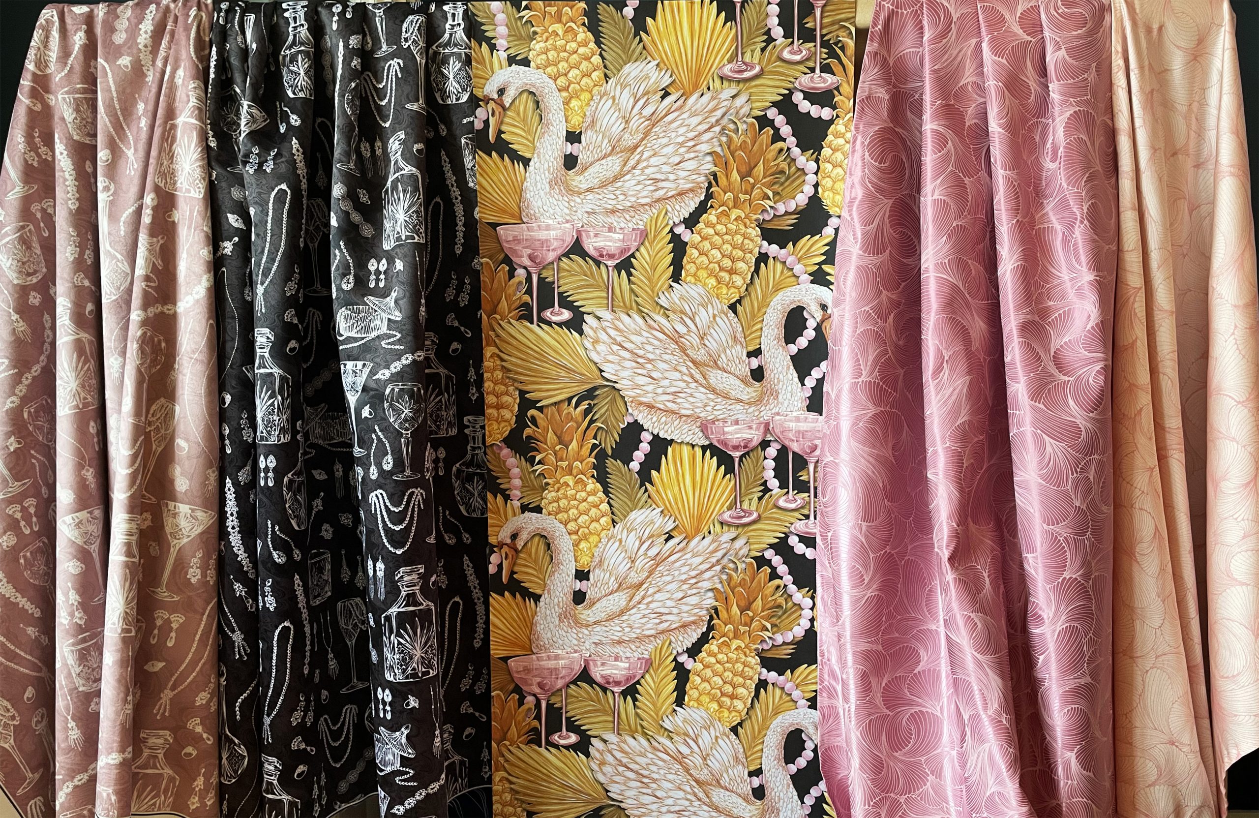

A Closer Look...
This is a closer look at the fabrics and wallpaper designs from Image 1, showing more of the detail and colours and how they all work together.
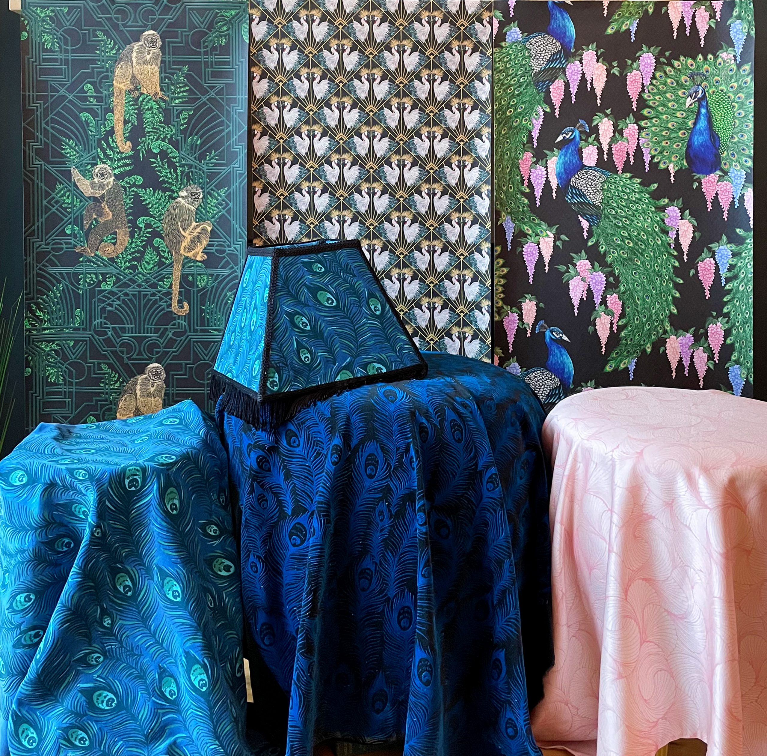

'Animal Mania'
This image shows most of my wallpapers, three out of four. All of my wallpapers link together via the black backgrounds, they are all bold interesting aimed to capture the attention of guests, making them want to look further into the designs. They are not intended to be visualised in the same room, yet all have this common theme of mixing deco and this 1920's idea of 'animal mania'. The wallpapers are all digitally designed from my drawings and paintings and are all designed to sit well with my fabric designs. The two peacock feather colourways (bottom left) were done in the print room, both on directly dyed cotton velvets and are perfect for upholstery. I have upholstered a lampshade, fitted with black fringing for that 1920s feel to go on my quirky gold sculptured lampshade base. The black, greens, blues and hints of pink all complement each other and these designs are a mix of masculine and feminine.
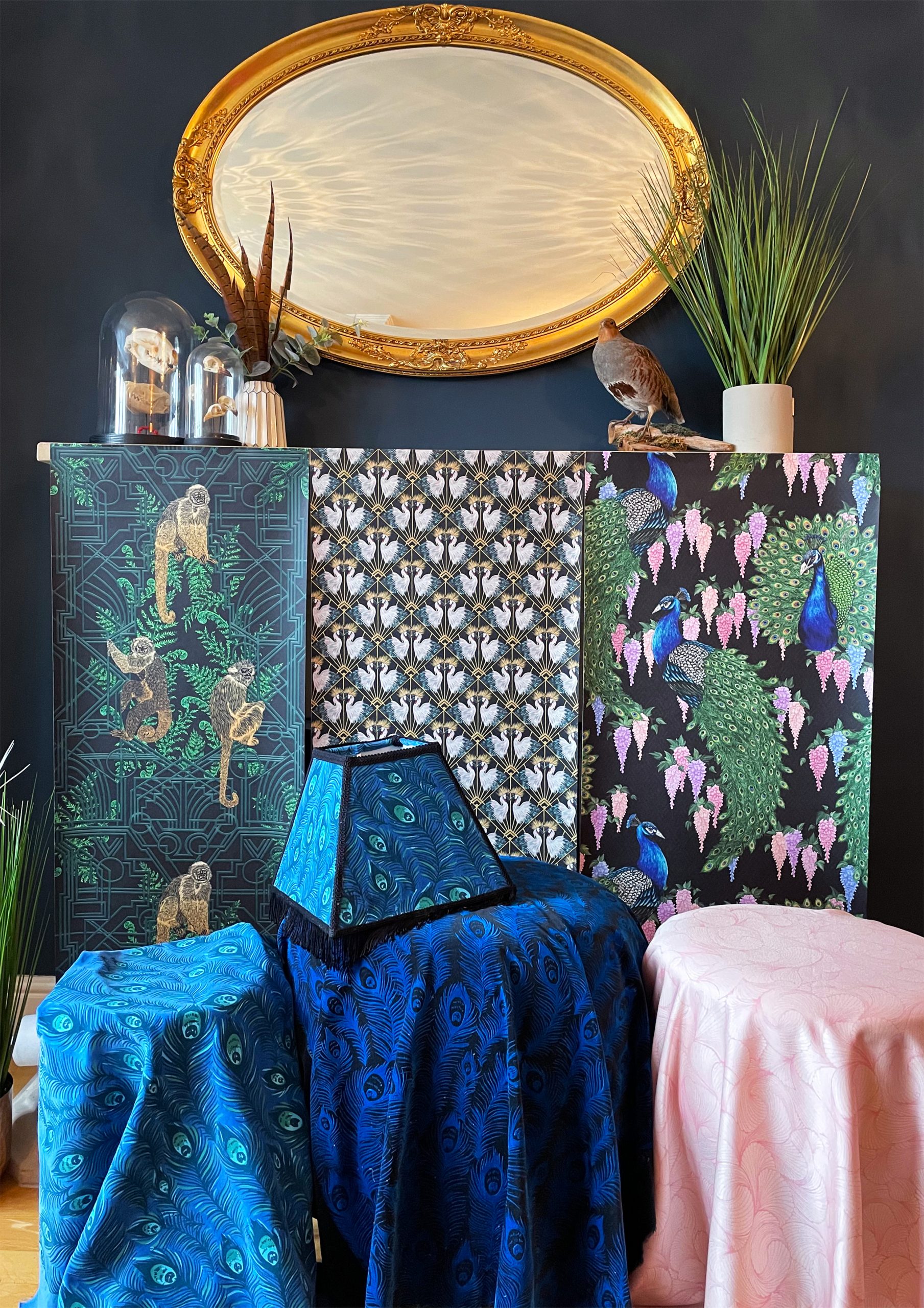

A Closer Look...
This image is a different shot of the image above, showing them in a space that is a similar vibe to my context. Gold accents, dark walls and quirky decorative objects and plants.
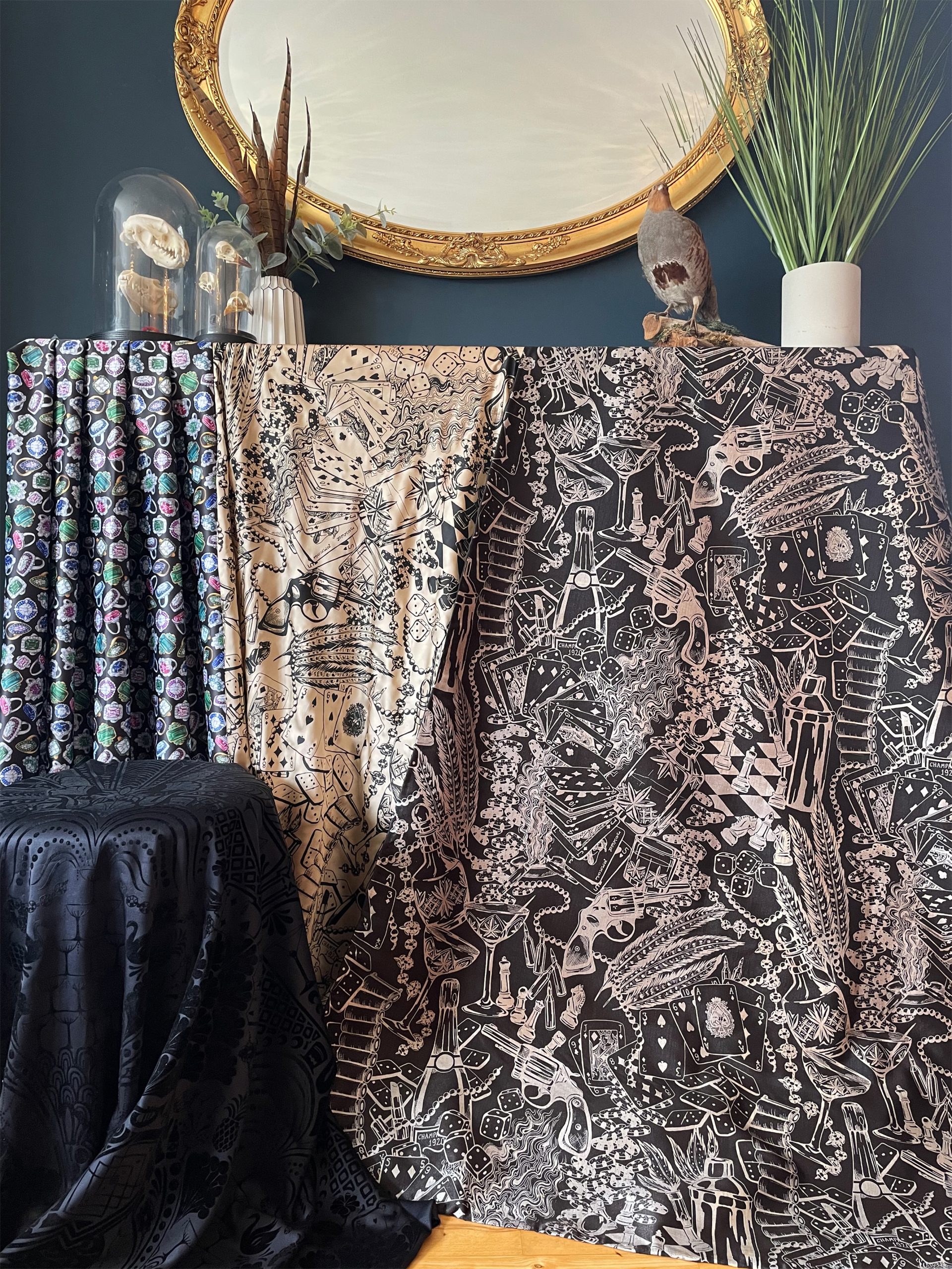

The More 'Masculine' Part of The Collection
This image shows the more masculine part of the collection. My repeat lengths, done in the print room (right) are done in reverse colourways; a black pigment on a champagne polyester silk and a gold pearlescent pigment on black dupion silk. This design is my Gambling gangster print, telling this illustrative story of gambling in the 1920s, representing the fun and extravagance lifestyle. This as a hanging length shows the detail and design well. The ring design (left) is digitally printed from my drawings, I scaled it up to make it more suitable for interior design; this would work well as a cushion with bold pink piping for the physical exhibition. This jewellery design works well as both masculine and feminine sides of the collection. At the bottom is a black flock design on a navy silk Alexander McQueen fabric, this will be a footstool with black fringing, showing off the luxurious style with the subtle, yet detailed design, capturing the interest of the guests at the hotel.
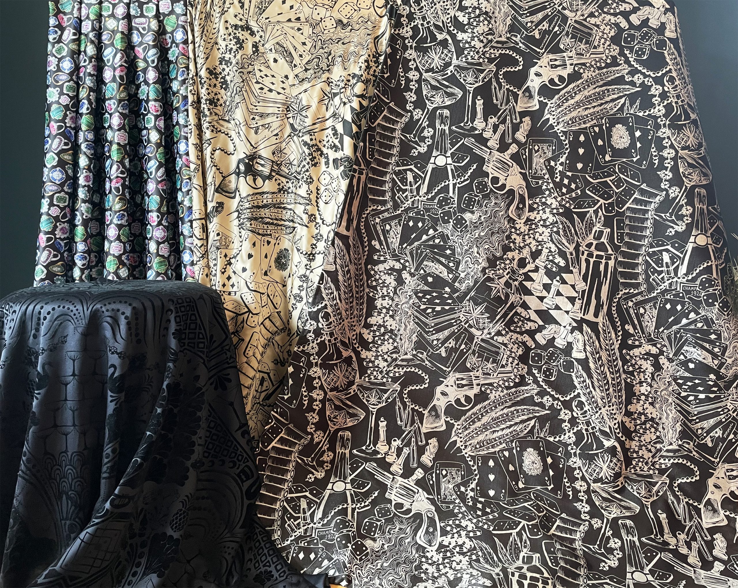

A Closer Look...
This is again, a closer look at the fabrics in the previous image, looking more at the detail and colour.
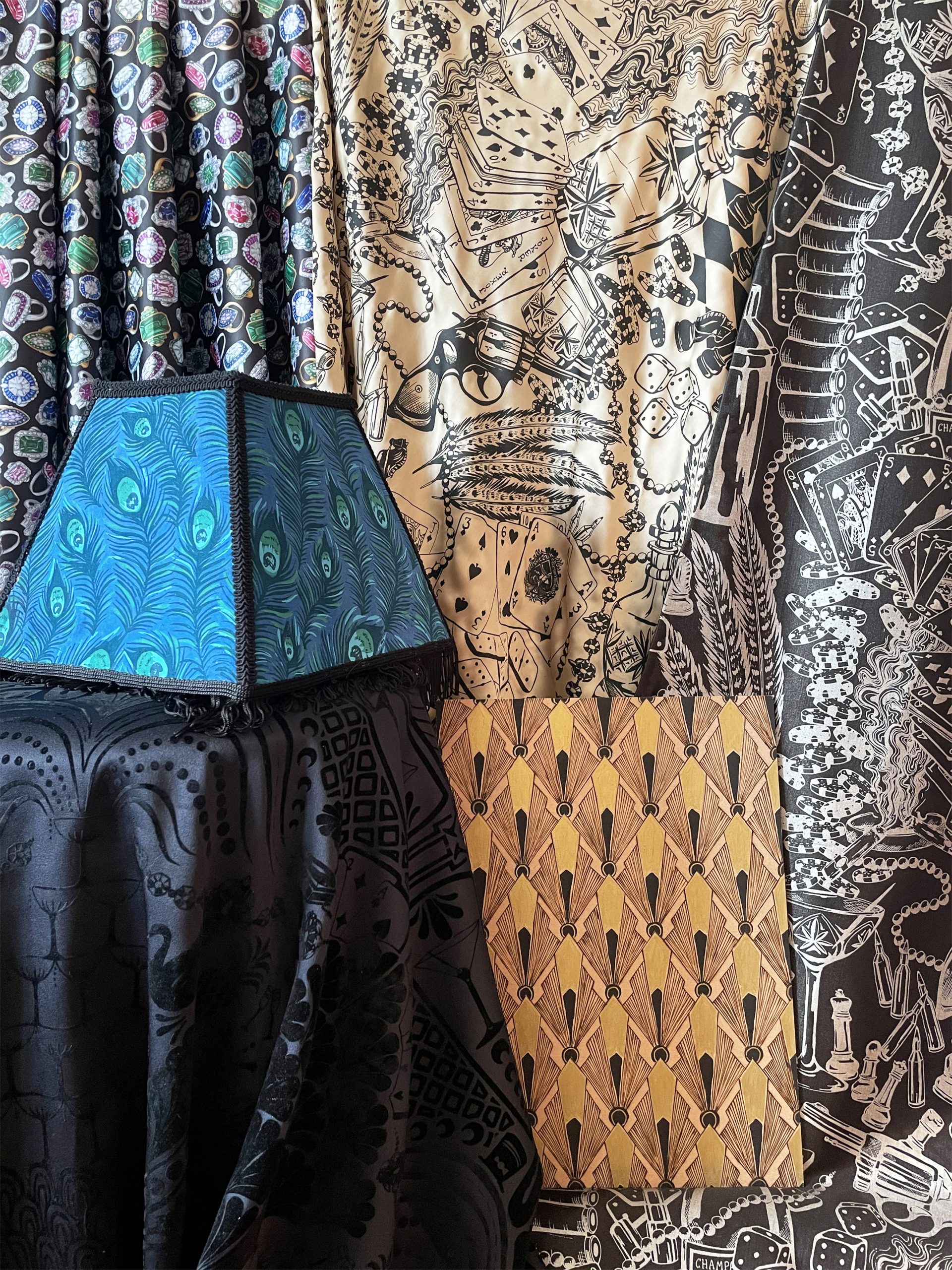

This image shows a closer look at the above images, with my upholstered peacock feather lampshade in the mix, showing how they all work together and adding in my wood pyrography design which I will feature a few of in my physical exhibition. This image also shows how detail and the shine of the materials shows up in the natural light. The wood pyrography was new to me and, with practice I have got neater and it has got easier. It also adds texture which is interesting and allows me to consider different applications such as draws, table surfaces, COVID-19 dividers and wall panels.
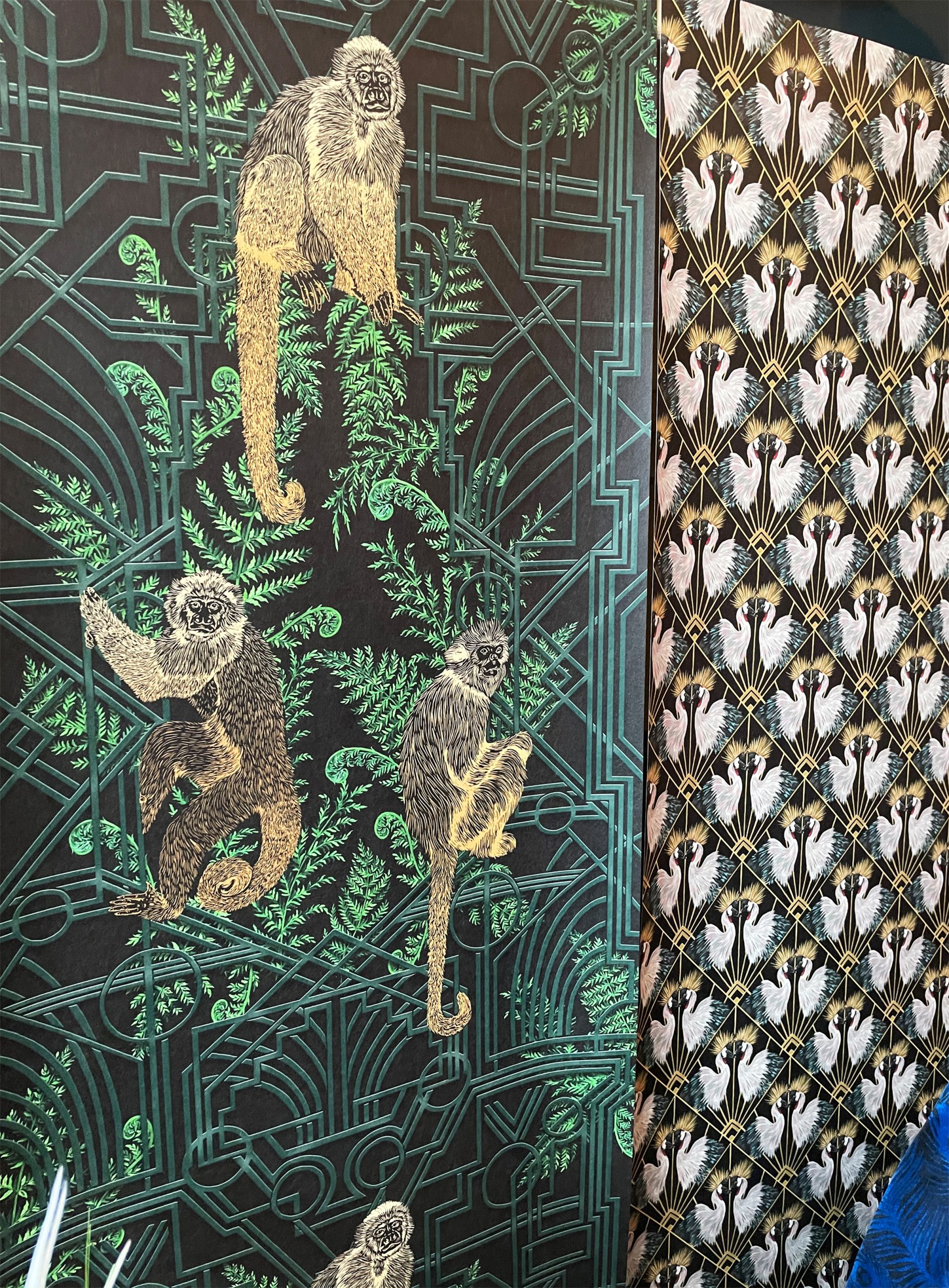

A Closer Look at Wallpapers...
This final image is a close up of my Monkey geo wallpaper and my Crane deco wallpaper. These both are a mix of painting and digitally printed 50cm wide onto wallpaper. I intend to cover some side draws in the crane repeat wallpaper for the physical exhibition to show the multi uses of wallpaper designs and I also want to paint into all four of my wallpapers to add more depth and detail that is potentially lost when printed flat onto the paper. The Monkey design also goes well with my sculptured monkey lampshade base, which will have the peacock feather lampshade top on. This shows how even though each design is different, they all interlink and work well together and as a collection.
Evie Sharp
I have always been inspired by the extravagance and flare brought on by the social and economic changes of the 1920s. My project brings to life this atmosphere, in a quirky and memorable way, capturing a modern stylized interpretation of ‘the Roaring '20s’.
My collection aims to inspire and capture the attention of guests at a large luxury hotel and party venue in London. The context of the space will reflect this luxury, yet quirky unique take on the 1920s with a dark atmospheric art deco styling to the furniture and rooms. This collection presents a modern, fashionable take on the traditional 1920’s theme with a sense of escapism to a bygone era.
Through research and inspirational images, this collection represents the decadent side of the era. My designs are inspired by 1902’s gangsters, flapper girls and art deco design; having a mixture of masculine and feminine designs inspired by these strong images of the decade. I have also considered the idea of ‘animal mania’, having exotic animals and birds as pets, as a sign of wealth and extravagance. I have used my strengths in drawing and painting, as well as colour, to create a mixture of screenprints and digital designs for fabric and wallpaper. I have also experimented with sculpture and wood pyrography to create a considered collection for my intended context. Using accents of gold as well as luxurious fabrics and designs show the high quality, luxurious and glamorous vibe for this hotel and venue.
Final year project
The Roaring '20s
Work Experience
During my placement year, I did 3 months at Marks and Spencer in the Home and Beauty department in London. I loved this, having worked in the home department in an M&S store before I was aware of their collections and style and have always been a fan. I got the opportunity to work on many different areas within the department and I helped my team with anything that they needed, so the jobs I did were varied and I learnt a lot. Over time, I gained more responsibility and started helping with the design process itself, being able to show my drawing and painting skills. In fact, some designs that I did during my 3 months are now in stores as part of their Spring/Summer 2021 collections. This is hugely exciting and something that I am very proud of and such a rewarding experience to take out of my placement year.
I also did 3 months of work experience in London for a print design studio, Whiston and Wright Ltd. I helped with the sewing and styling of their printed fabric designs and learnt the entire process of how a design studio is run; from designing to logging and processing. This was very useful, considering my future career aspirations. I improved my sewing skills and even got to do some designing myself, under the guidance of the head of the company; which was a great experience for my final year, considering colour, placement, scale and atmosphere of a design.
I spent 2 months at another print studio in London, Amanda Kelly Ltd, where I helped the print designers finish and process their designs to be sold. I was able to see many inspiring designs as well as improve my sewing skills. I also was responsible for completing client requests to make changes to purchased designs. This greatly improved my CAD skills; changing colourways, scales and making designs into repeats. I was trusted to contact clients directly and I used my organisation skills to help create a new logging and filing system for old unsold fabrics which was very much appreciated. I didn’t get to design but I learnt a lot and saw the differences between the two design studios. I was able to showcase my own skills and helped with ideas to make their systems run smoother. I even got the chance to sell to the buyer for ASOS, which was a fantastic and eye-opening experience! I got great feedback from the staff and head designer and found my time very rewarding.