Emily Larson
Graphics
Final year project
Alternative Depression [Read more]
Alternative Depression
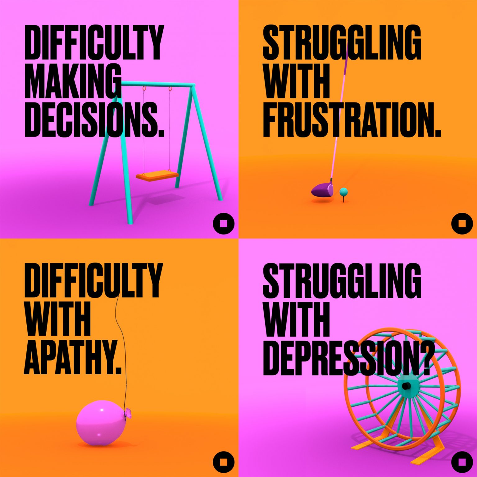
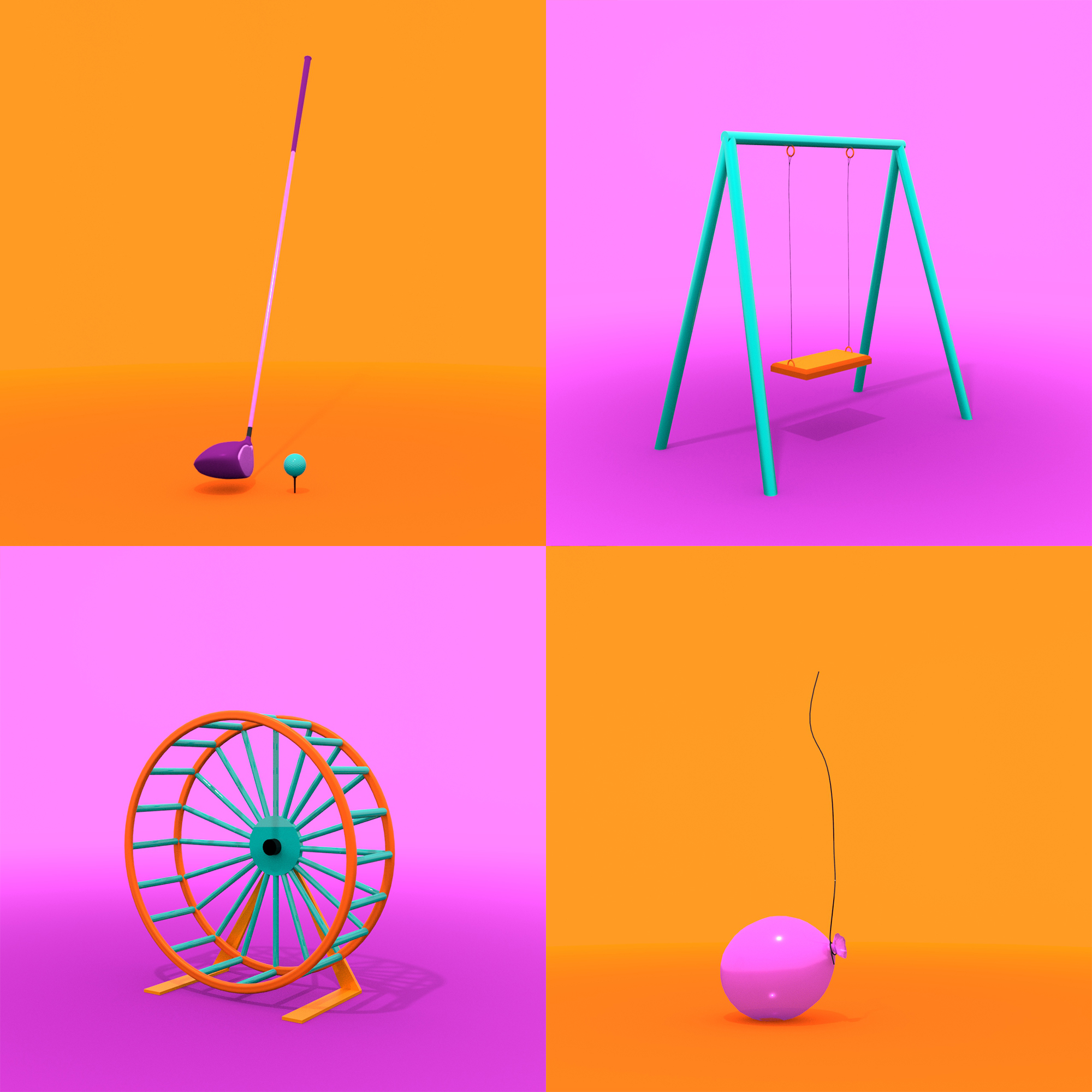
Although mental health, particularly depression, is much more openly talked about now than it has been in the past, there are still prominent stereotypes about depressive symptoms. This can lead to a lack of diagnoses, particularly in young adults and graduates; lacking mental health support after leaving education, they may not be aware that symptoms they are experiencing can point towards depression. I set out to change that. I decided to use unique object metaphors to represent different groups of symptoms, employing bright, bold colour schemes to appeal to a younger audience and juxtapose the existing imagery surrounding depression. Each object's movement elicits a visceral response and helps the audience to recognise and better understand underrepresented symptoms of depression.
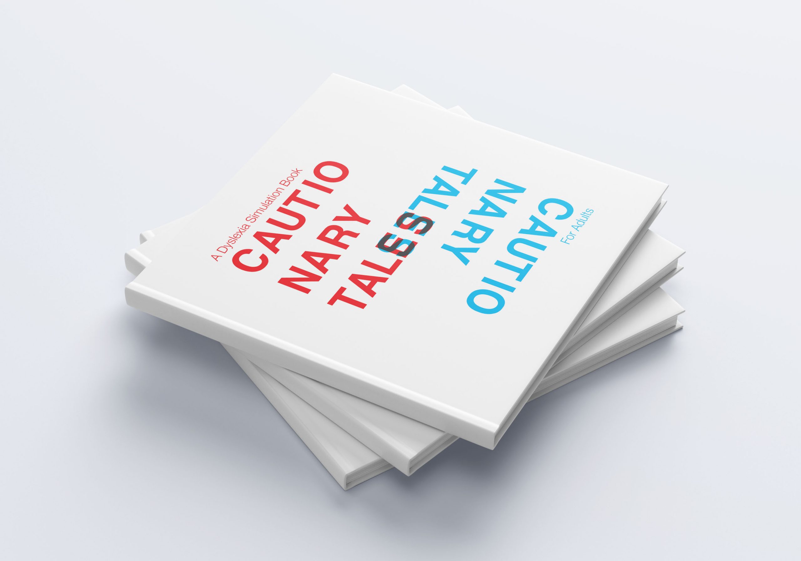
Cautionary Tales: A Dyslexia Simulation Book For Adults
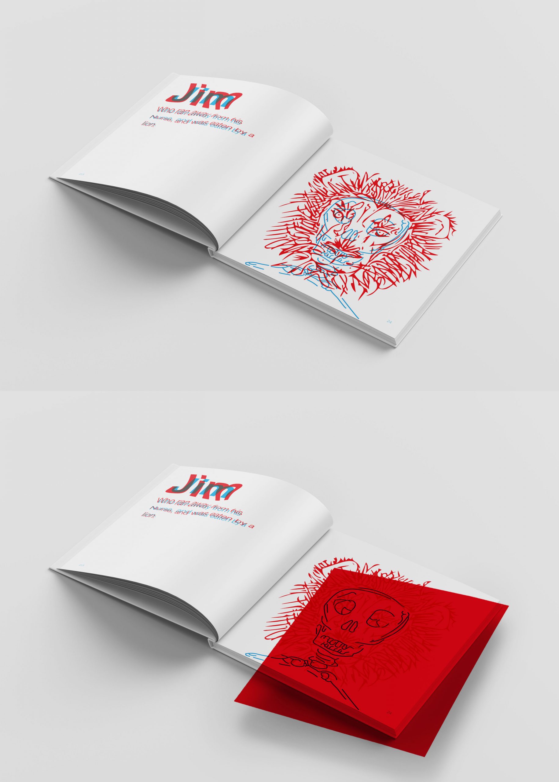
This group project tackled two problems simultaneously: the challenge of redesigning a selection of Cautionary Tales for an adult audience and the difficulties of reading with dyslexia. Our solution was to format six poems in a way that replicates how dyslexics experience reading, in increasing stages of severity. The book aims to help parents, carers and guardians understand how their children may be struggling with reading, and includes tips for formatting text in a dyslexia-friendly way. One of my contributions to the project was the cover design, hinting at the dual-layered text that appears throughout the book and presenting a clean, sophisticated cover that suits the target audience.
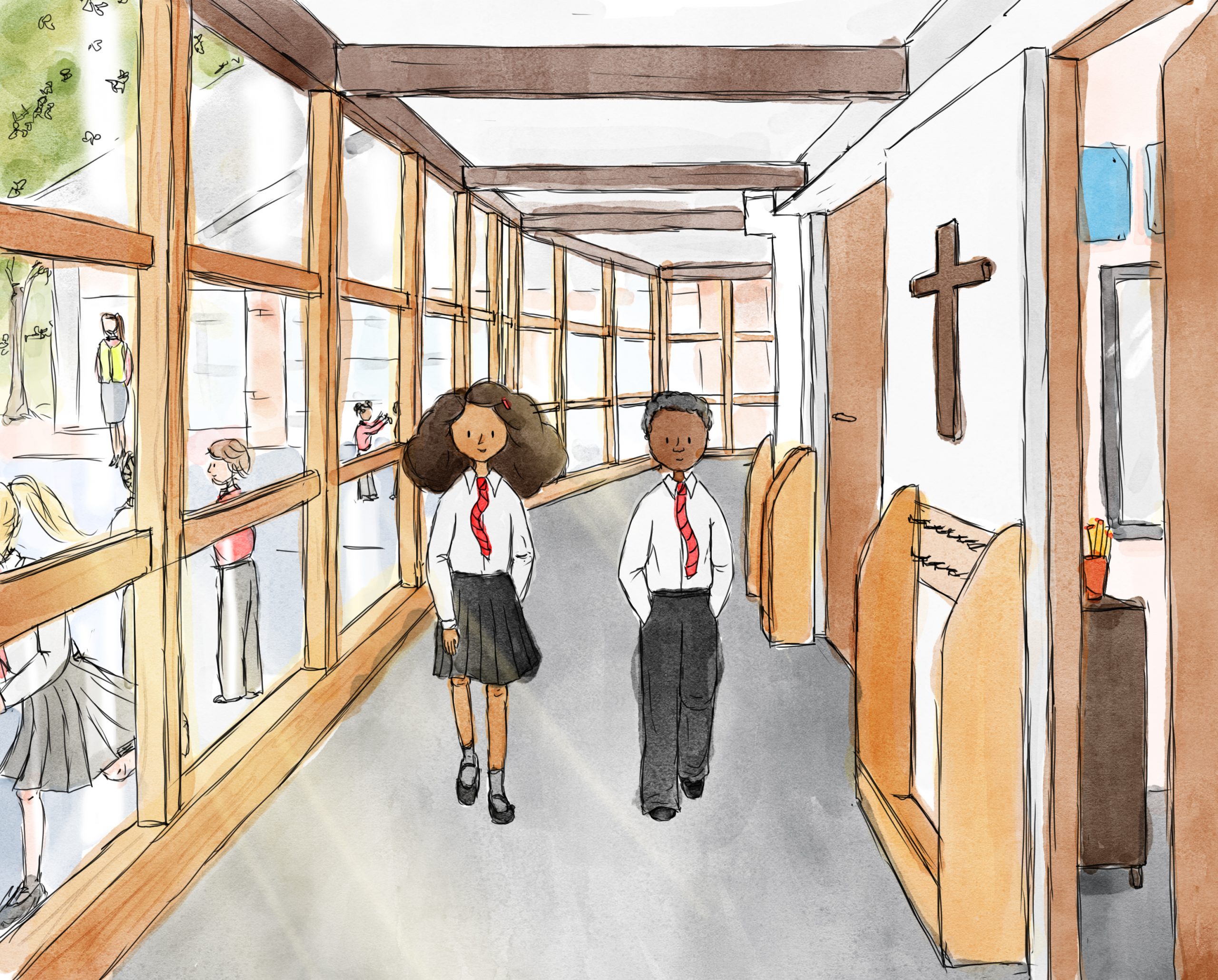
Up The Spiral Staircase: An Adventure Into the History of Christ the Saviour Primary School
(Current Project - Ongoing) For this project, I am designing and illustrating a commemorative children's book for a local primary school. The story celebrates the school's 160 years of history, with the main characters travelling back in time through the old school log book and meeting various people who were key to the school's growth over the years. The final book will be produced for the students in July in line with the school anniversary celebrations and will help children from reception through to year six experience the school's history in an engaging way through delicate, colourful illustrations.
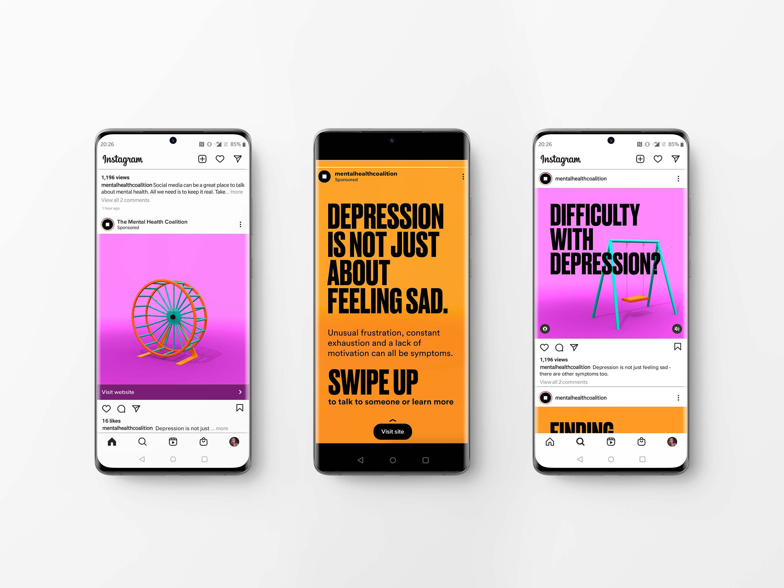
Alternative Depression Social Media Launch
With my target audience fresh out of education and ever-present on social media, it made sense to launch the Alternative Depression campaign through platforms like Instagram, Facebook and Twitter. Each full animation is short enough to be featured as a story, reel or even a TikTok. The campaign has also been created to align with The Mental Health Coalition, an organisation that strives to end the stigma surrounding mental health with a very active presence on social media.
Alternative Depression Styling
Creating a campaign that stood out from existing presentations of depression whilst still accurately representing the symptoms was a challenge. Ultimately I found objects to be the best way of representing visceral feelings that could be directly associated with symptoms like apathy, frustration, exhaustion and lack of motivation. I used Maya to develop and animate the chosen objects, resulting in a project that taught me new skills and tied in with current trends surrounding 3D design.
Dyslexia Simulation and Hidden Imagery
Whilst each poem was designed in such a way that made them difficult to read straight away, the book is provided with a red filter, that when overlaid on the pages reveals the plain text underneath. This allows the reader to see the contrast between how a non-dyslexic and a dyslexic may experience reading. The idea of the red filter came from existing research that indicates that some people with dyslexia find colour filters helpful in reading, as they decrease the contrast between text and background colours. As a well multi-layered text, the illustrations in the book were designed to have a hidden picture in them, reflecting the darker underlying messages of the poems as well as the statistic that dyslexic is often particularly creative and more visually literate than their non-dyslexic peers.
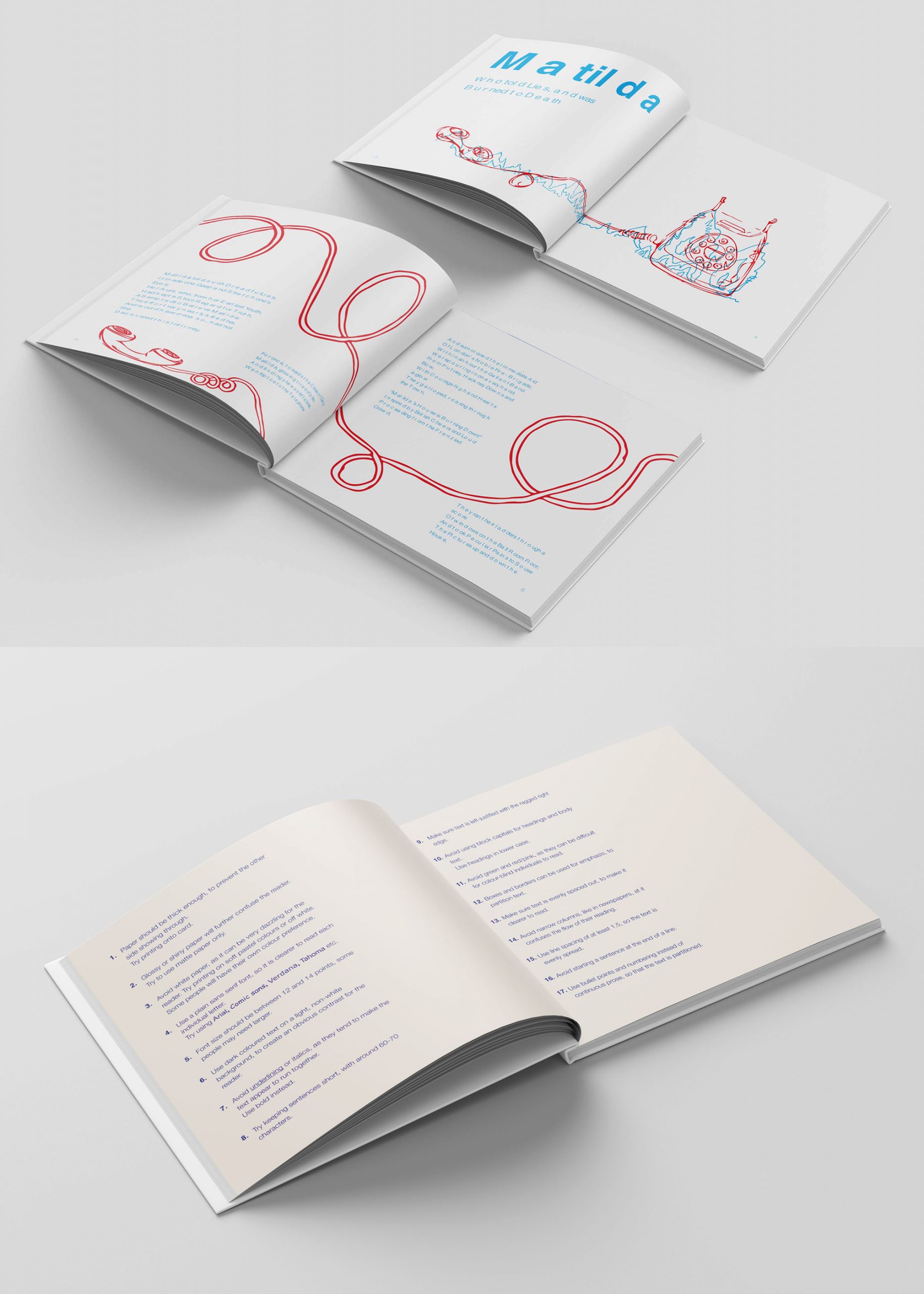
'Matilda' Layout and Tips to Support Dyslexic Reading
Working as a group allowed us to delegate responsibilities for different aspects of the book; I took on the role of project director and was responsible for organising the layout across the book and planning the pages, including designing the cover. 'Matilda' was one poem that I designed the layout for, including drafting imagery before it was handed to another illustrator, and arranging typography to uniquely simulate the experience of reading with dyslexia. As well as helping people understand dyslexia, we also wanted to encourage change, and so included Tips pages at the end of the book that explains the best ways to format text in order to make it as readable as possible for dyslexics. The Tips pages were themselves formatted in a dyslexic-friendly way (for example, using navy text on a cream background), to represent the difference that small adjustments can make for those with reading difficulties.
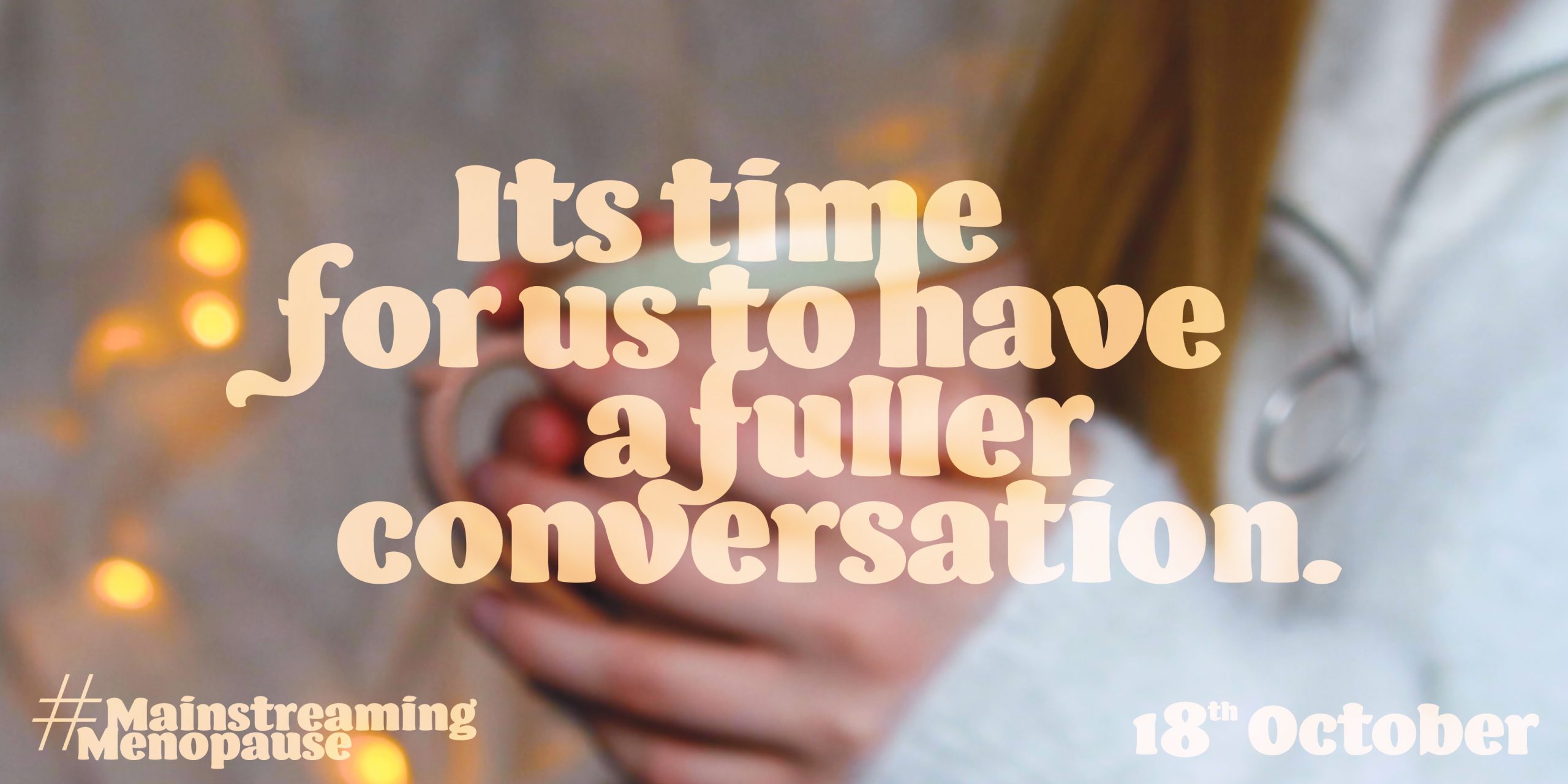
Mainstreaming Menopause
The Mainstreaming Menopause campaign was designed for the Refinery29 and The Case for Her D&AD brief. The campaign aims to get people to be more open about their experiences with menopause, to begin a more inclusive conversation the educates and encourages people with ovaries who will go through menopause at some stage in their life. The campaign video uses diverse voices and a variety of visual languages to present the good, the bad and the ugly parts of menopause, creating an optimistic view of menopause as the start of a new phase of life, rather than the end to one.
Emily Larson
I'm a UK-based illustrator and designer with a passion for image creation and bringing ideas to life, both on paper and on a screen.
I have an exceptional eye for detail and an affinity for a problem-solving and capturing character in my designs. As much as I enjoy traditional illustration, from 50p biros to Winsor & Newton watercolours, I also have a love for digital design and have used my four years at Loughborough University to squeeze out every drop of creative experimentation possible through various self-directed projects. Looking forward, I'm passionate about opportunities that will enable my visualisation skills to develop, expand and take me in new directions. I am always looking to learn and am hopeful that my design education won't stop once I leave the university.
Final year project
Alternative Depression
Work Experience
I spent 12 months at Debenhams during my placement year, taking on the role of Junior Digital Designer. Initially, I worked primarily on web design, creating imagery for multiple different types of pages and managing weekly updates to website content. Later in the year, I was given the opportunity to expand my responsibility by taking on print design, collateral creation and webpage design opportunities, producing original content for the Debenhams website, store windows and in-store journey.
I have an ongoing collaboration with local business Hanwell Prints, creating illustrations that show Hanwell in all its lovable London glory. Born from owner Marta's love for her local community, my illustrations bring Hanwell hotspots to life and reflect the diversity, history, and character of the area. Ranging from detailed architectural drawings to colourful vector illustrations, my work appears on prints, tea towels, cards and more that appeal to the local community and help to build an appreciation for the beautiful landmarks that populate Ealing and Hanwell.